


/ Interface Design / 7. Semester: "GUI - History of Graphical User Interfaces"
"GUI - History of Graphical User Interfaces" is a project that was planned to serve as a reference work from the very beginning. Graphical User Interfaces - abbreviated GUI - have existed for 20 years now and if you look closely there is not so much that has changed. Of course at first glance one could think that there is a lot of difference between a modern GUI like Mac OS X or Windows XP and its predecessor, the Macintosh (Classic) or Windows 3 respectively. But those differences relate rather to the formal aspects of the GUIs not as much to their productivity which remains more or less as effective as it was. Moreover one could argue that the basic idea - in this case the window and the desktop metaphor respectively - was so efficient and stable thus reinventing the wheel would not be necessary.
However the question if the existence of modern GUIs in their current shape is justified or not should not be answered within this project. My intention has been rather to sensibilize the reader and user for this topic.
The project is composed of three parts:
- Chronology of the graphical user interface
- Conception of a Poster-Computer-Interaction
- Conception of a laboratory environment for the GUI's 'user controls'
In the first part the reader learns about the most important details of the different GUIs. In order to keep them comparable I tried to examine the same elements, e.g. typography, icons, windows and user controls etc. of each GUI. Of course it is sometimes almost impossible to find out about every detail of a historical GUI that is either very old or simply wasn't widely spread. Besides the examination of all the past GUIs since the early 1980s would have gone beyond the scope of time so I made a careful selection of the most important ones.
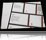
The second part tries to a greater or lesser extent outlining the first chapter into the shape of a poster. Though the poster doesn't stand alone but is expanded to include an additional interactive application which enhances the poster's content. Moreover this kind of symbiosis of both types of media has got a symbolic character, as first of all the printed medium shows us where we come from and secondly both medias present their strong and weak aspect (on the one hand the poster is still able to cover a much bigger area with a much higher resolution +-600lpi or dpi and thus delivers a much better summary compared to a display which is in average +-21 inch big with a 72dpi resolution, on the other hand there is this static versus dynamic discrepancy) but are able to complement each other pretty well.
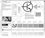
The third part called ButtonLabor is actually the one that should have the biggest influence on the reader (in this case literally the user). Here one experiences the modern GUI's real world metaphor roots in the best manner when setting up different parameters like light direction, shape, the button's upstroke etc.
Glossary
-
Computer graphics
Computer graphics are graphics created using computers and, more generally, the representation and manipulation of image data by a computer. The development of computer graphics, or simply referred to as CG, has made computers easier to interact with, and better for understanding and interpreting many types of data. Developments in computer graphics have had a profound impact on many types of media and have revolutionized the animation and video game industry.
Please read on further information at wikipedia.org
-
Input device
An input device is any peripheral (piece of computer hardware equipment) used to provide data and control signals to an information processing system (such as a computer). Input and output devices make up the hardware interface between a computer as a scanner or 6DOF controller.
Please read on further information at wikipedia.org
-
Microprocessor
A microprocessor incorporates most or all of the functions of a computer's central processing unit (CPU) on a single integrated circuit (IC, or microchip). The first microprocessors emerged in the early 1970s and were used for electronic calculators, using binary-coded decimal (BCD) arithmetic on 4-bit words. Other embedded uses of 4- and 8-bit microprocessors, such as terminals, printers, various kinds of automation etc, followed rather quickly. Affordable 8-bit microprocessors with 16-bit addressing also led to the first general purpose microcomputers in the mid-1970s. Computer processors were for a long period constructed out of small and medium-scale ICs containing the equivalent of a few to a few hundred transistors. The integration of the whole CPU onto a single chip therefore greatly reduced the cost of processing capacity. From their humble beginnings, continued increases in microprocessor capacity have rendered other forms of computers almost completely obsolete (see history of computing hardware), with one or more microprocessor as processing element in everything from the smallest embedded systems and handheld devices to the largest mainframes and supercomputers. Since the early 1970s, the increase in capacity of microprocessors has been known to generally follow Moore's Law, which suggests that the complexity of an integrated circuit, with respect to minimum component cost, doubles every two years. In the late 1990s, and in the high-performance microprocessor segment, heat generation (TDP), due to switching losses, static current leakage, and other factors, emerged as a leading developmental constraint.
Please read on further information at wikipedia.org
-
Font rasterization
Font rasterization is the process of converting text from a vector description (as found in scalable fonts such as TrueType fonts) to a raster or bitmap description. This often involves some anti-aliasing on screen text to make it smoother and easier to read. It may also involve "hinting", that is, the use of information precomputed for a particular font size.
Please read on further information at wikipedia.org
-
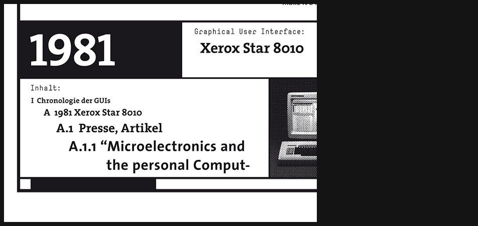
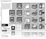
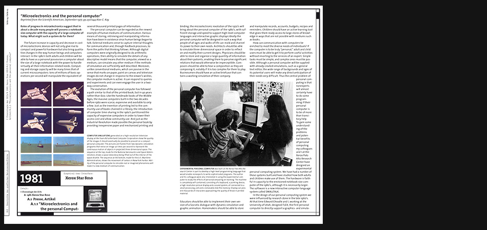
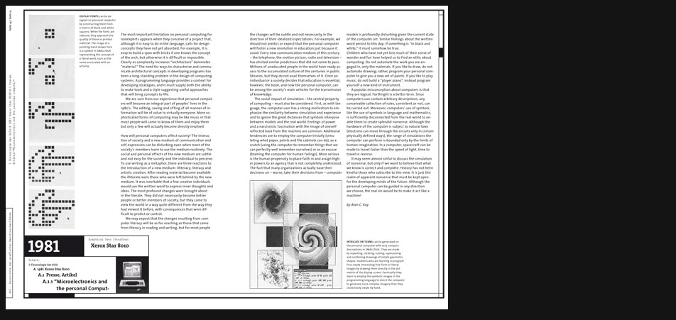
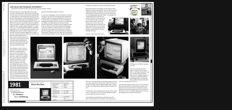
1981 Xerox Star 8010
This graphical user interface marks the beginning of modern GUIs.
Although the research at the famous Xerox Palo Alto research center began much earlier building the experimental Xerox Alto system the Star became the first commercially sold and available GUI of our time. -
Investigation - old stories
Researching especially those old, groundbreaking user interfaces like the Xerox Star which are lost to our generation because of their inaccessability I had to gather many old articles about them in order to find out more about their behavior, their "Feel".
-
Investigation - old stories
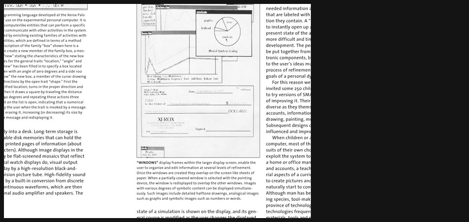
The screenshots here for example show a reorganized artcile from the computer magazine "byte" which handles the technical aspects e.g. the computer language(s) developed for the Star making the graphical user interface possible at all.
-
-
-
Investigation - old stories
Story excerpt:
"...
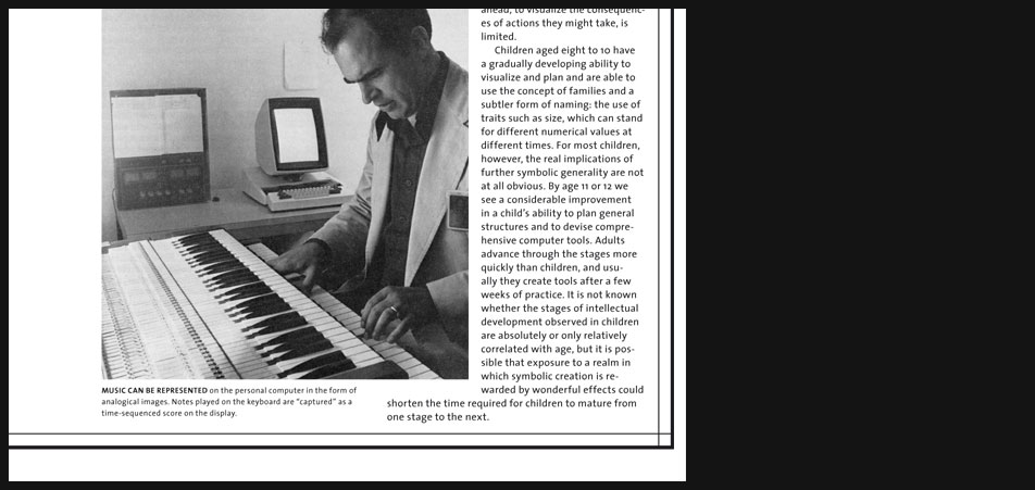
MUSIC CAN BE REPRESENTED on the personal computer in the form of analogical images. Notes played on the keyboard are captured as a time-sequenced score on the display. ..." -
-
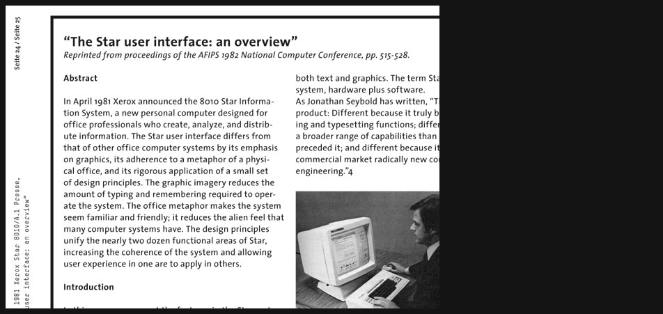
Another vintage paper
This paper describes very precisely nearly every aspect of the Star's user interface functionality.
-
Another vintage paper - Excerpt
"...
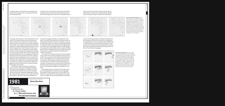
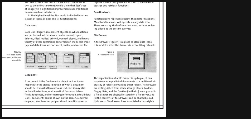
Icons
An icon is a pictorial representation of a Star object that can exist on the Desktop. On the Desktop, the size of an icon is approximately 1 inch square. Inside a window such as a folder window, the size of an icon is approximately ¼-inch square. Iconic images have played a role in human communication from cave paintings in prehistoric times to Egyptian hieroglyphics to religious symbols to modern corporate logos. Computer science has been slow to exploit the potential of visual imagery for presenting information, particularly abstract information. Among [the] reasons are the lack of development of appropriate hardware and software for producing visual imagery easily and inexpensively; computer technology has been dominated by persons who seem to be happy with a simple, very limited alphabet of characters used to produce linear strings of symbols. One of the authors has applied icons to an environment for writing programs; he found that they greatly facilitated human-computer communication. Negropontes Spatial Data Management system has effectively used iconic images in a research setting. And there have been other efforts. But Star is the first computer system designed for a mass market to employ icons methodically in its user interface. We do not claim that Star exploits visual communication to the ultimate extent; we do claim that Stars use of imagery is a significant improvement over traditional human-machine interfaces. At the highest level the Star world is divided into two classes of icons, data and function icons: ..." -
-

-
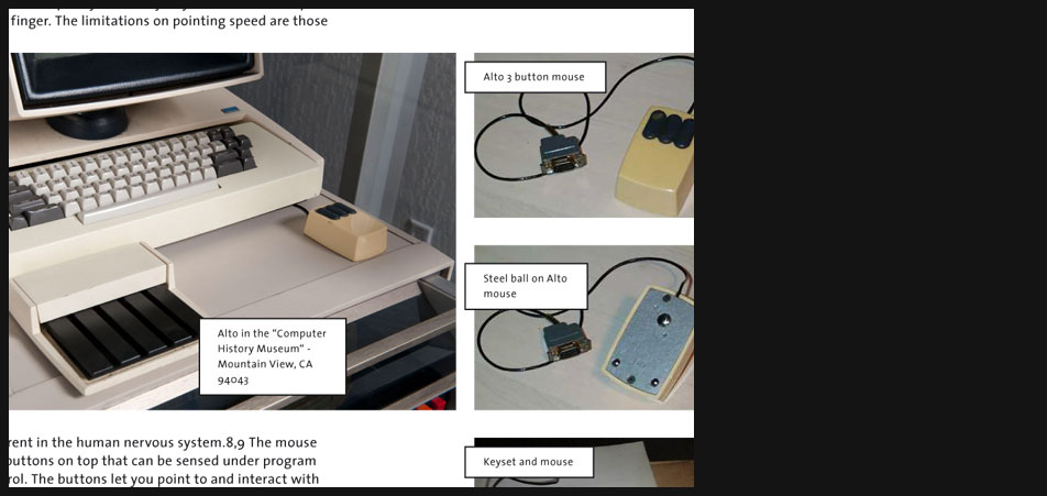
Xerox Star Hardware
On the one hand the Star was sold as a complete package which included soft- and hardware. Thus describing its user interface you always have to consider both aspects. On the other hand when it comes to operating systems which were sold separately from the hardware later (e.g. Microsoft products) still these two worlds remain inseparable, since it is the hardware that either advances or constrains the GUI.
Considering the hardware either sold together with the GUI or appearing in the particular time of the GUI software's market launch is thus one aspect which has been analysed in almost every GUI chapter. -
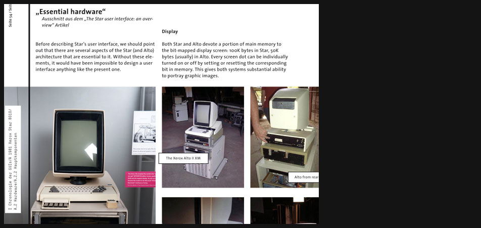
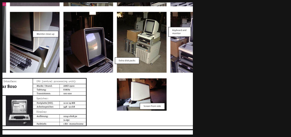
Xerox Star Hardware
On the pictures you can see some Xerox Alto hardware. I didn't dedicate an extra chapter for the admittedly first GUI, the Xerox Alto for several reasons. It wasn't a commercial product rather an experimental approach which served for the development of the later Star. Unlike the very rare public material about the Star it is even much harder to find out sth. about the Alto.
-
-
-
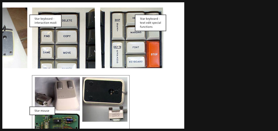
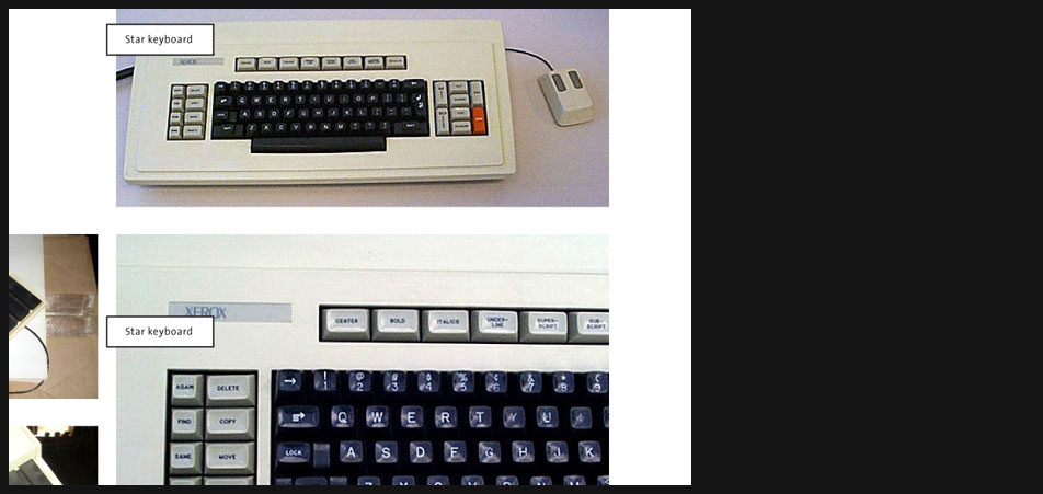
Xerox Star Hardware
A very interesting aspect about the Star keyboard are its 'special function' and 'interaction modi' keys. E.g. not until you chose the anticipated interaction like 'move' or 'copy' with a 'function key' on the keyboard, you are allowed to execute the chosen function with the mouse.
-
-
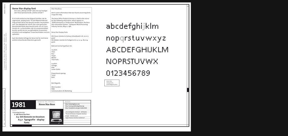
Xerox Star Typography
Even after an extensive dialog with Xerox it was impossible for me to find the fonts used as display fonts on the Star.
-
Xerox Star Typography
Finally I extracted one specific font from all the gathered screenshots I could find.
-
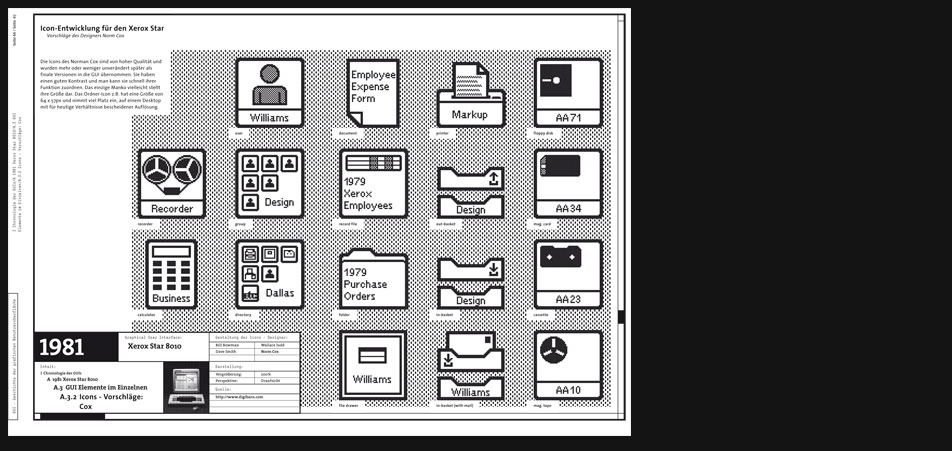
Xerox Star Icons
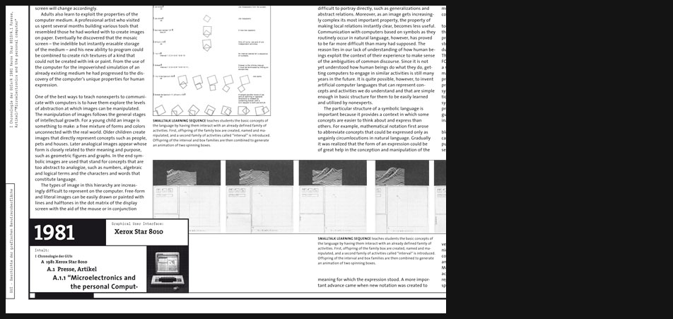
Development - Cox
Four designers worked on the icon design at Xerox and four significantly differing proposals were presented. This proposition here was chosen later almost without any changes. -
-
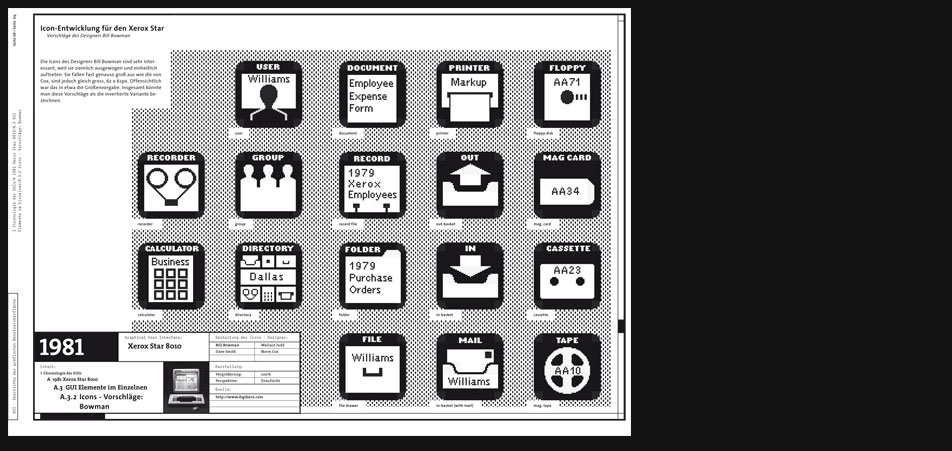
Xerox Star Icons
Development - Bowman
This proposal here was designed by Bill Bowman. In General it can be described as the inverted version. It has a good quality too because the icons have the same size and a very consistent and balanced appearance. -

Xerox Star Icons
Development - Smith
On the other hand this proposition by Dave Smith here is very interesting being a completely different approach which uses the perspective. Besides perspective is only used consistently for objects which are also in the real world threedimensional, plane things like a paper sheet stay flat and even in their icon entity. -
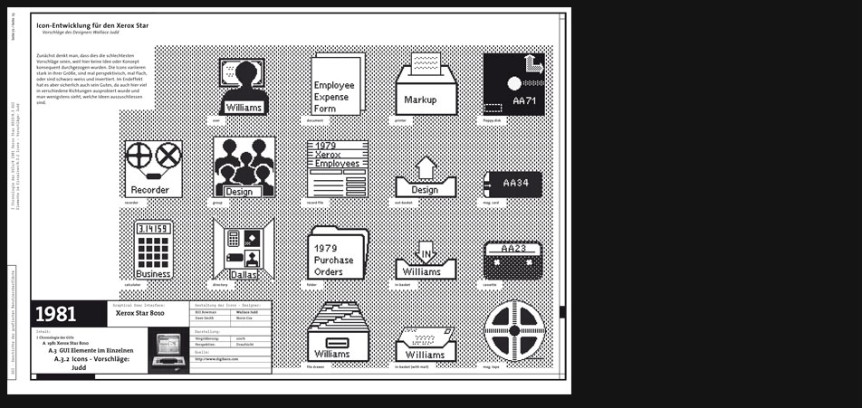
Xerox Star Icons
Development - Judd
In the first moment one could think that this is the worst proposal because the icons here lack any kind of consistency. They vary strongly in their size, perpective and color (one is inverted the other is 'normal'). Nevertheless I suppose that this proposal has got its own purpose and that is exploring many different possibilities and excluding some of them in the end. -
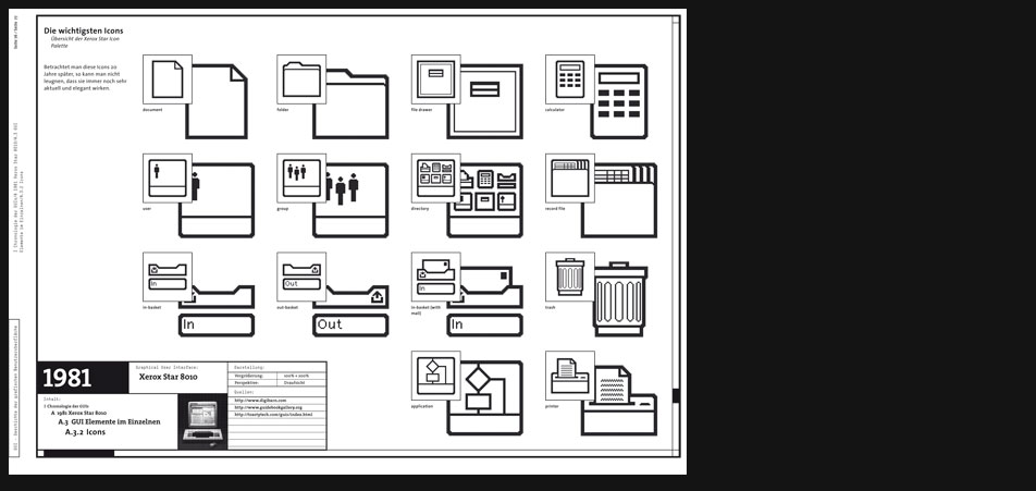
Xerox Star Icons
Final Icons
Even 20 years later one cannot deny that these icons still remain up-to-date. Xerox had put a massive effort in designing the Star GUI and the result was a visual quality which should stay unreachable for years or even decades to the competitors. -
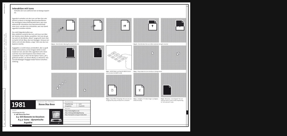
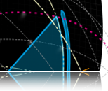
Xerox Star Icons
Interactive Behavior
One goal of the project was also trying to show the interaction with the GUI components in this case the icon on a classic medium as the paper is. E.g. here you can see how an exemplary action like 'pointing & selecting' worked on the Star. The difference to a 'modern' GUI was that after selecting the icon you had to activate a function mode on the keyboard in order to make the next step which would be either to move or to copy the icon or another function respectively. -
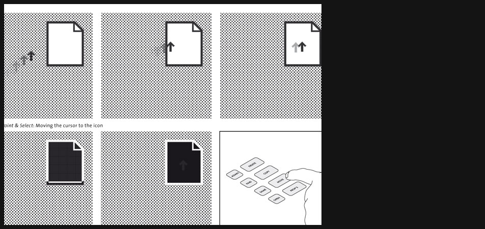
Xerox Star Icons
Interactive Behavior
Previous page zoomed in. -
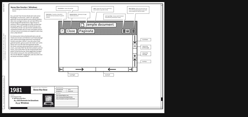
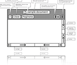
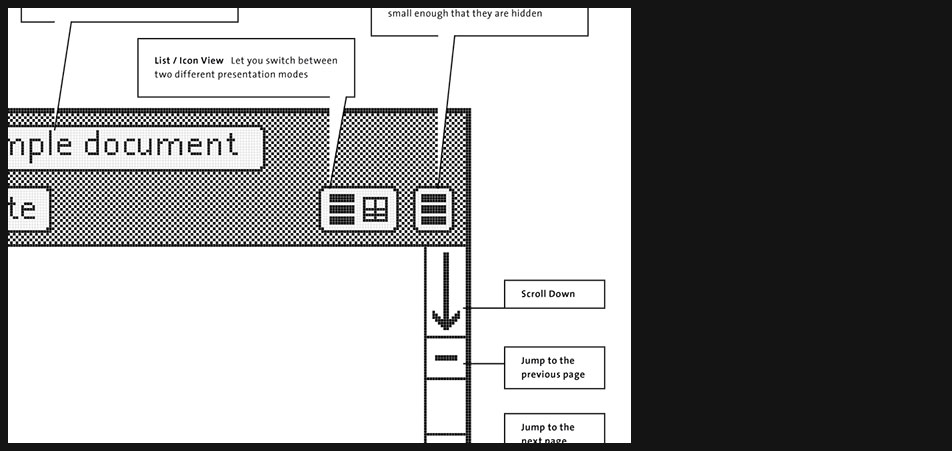
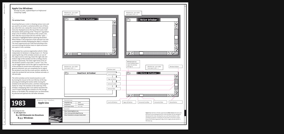
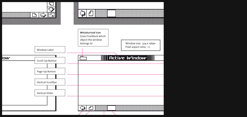
Xerox Star Windows
The usual Star window is similar to its successors on newer GUIs. It has a label which means that every open window is named after its related open entity like a folder or any other object that can be opened and presented as a window. Its content can be scrolled vertically or horizontally if necessary. Furthermore the Star window has one button to close it, another one for a dedicated content view - icon or list view - and a help button which invokes a help manual if necessary.
An interesting difference is the arrangement of the scroll buttons. Compared to modern GUIs these buttons are positioned inversely. E.g. the button for scrolling upwards is at the bottom and the button for scrolling left is on the right side. Of course the buttons are labeled correctly and the button for scrolling upwards has got an arrow pointing at the top, it's just somehow funny and shows that Xerox interpreted the scroll metaphor differently ...and maybe that one would have some difficulties to scroll to content in the desired way going back and interacting with the Star. -
Xerox Star Windows
previous page zoomed in
-
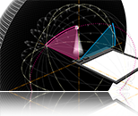
Xerox Star Windows
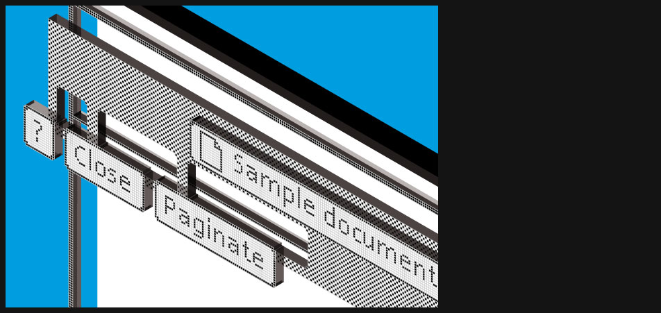
Isometric view on the individual elements
I decided to dedicate every chapter such a special view on a GUI's window because in my opinion such a view is able to show adequatly the functional complexity behind this GUI's most important element. A GUI window is build of different layers and has many different knobs and buttons like interfaces in the real world have too (e.g. a radio or a car's control instruments). It is not just a plane amount of pixels but an abstraction of something threedimensional and thus this view should sensibilize the viewer to this idea.
-

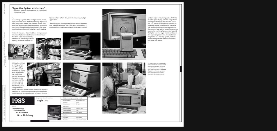
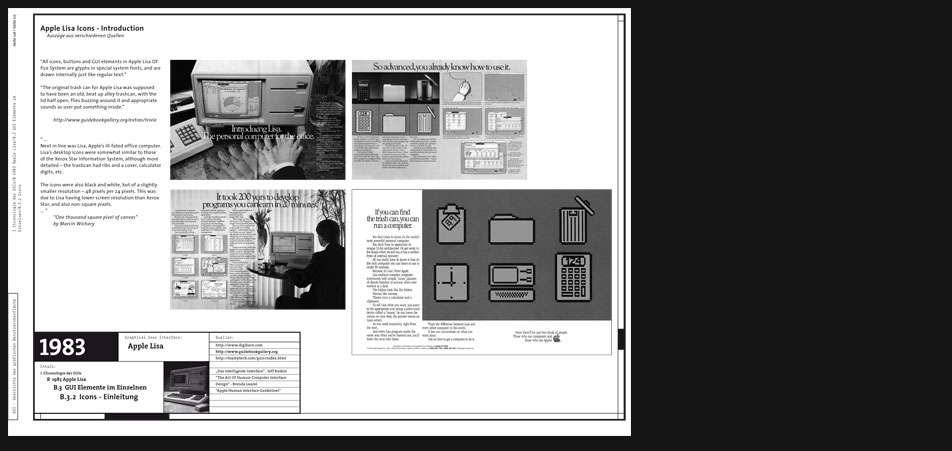
1983 Apple Lisa
"...
The Apple Lisa was a personal computer designed at Apple Computer, Inc. (now Apple, Inc.) during the early 1980s.
The Lisa project was started at Apple in 1978 and evolved into a project to design a powerful personal computer with a graphical user interface (GUI) that would be targeted toward business customers.
Around 1982, Steve Jobs was forced out of the Lisa project, so he joined the Macintosh project instead. Contrary to popular belief, the Macintosh is not a direct descendant of Lisa, although there are obvious similarities between the systems and the final revision, the Lisa 2/10, was modified and sold as the Macintosh XL.
The Lisa was a more advanced (and far more expensive) system than the Macintosh of that time in many respects, such as its inclusion of protected memory, cooperative multitasking, a generally more sophisticated hard disk based operating system, a built-in screensaver, an advanced calculator with a paper tape and RPN, support for up to 2 megabytes of RAM, expansion slots, a numeric keypad, data corruption protection schemes such as block sparing, non-physical file names (with the ability to have multiple documents with the same name), and a larger higher resolution display. It would be many years before many of those features were implemented on the Macintosh platform. Protected memory, for instance, did not arrive until the Mac OS X operating system was released in 2001. The Macintosh, however, featured a faster 68000 processor (7.89 MHz) and sound. The complexity of the Lisa operating system and its programs taxed the 5 MHz Motorola 68000 microprocessor so that the system felt sluggish, particularly when scrolling in documents. ... -
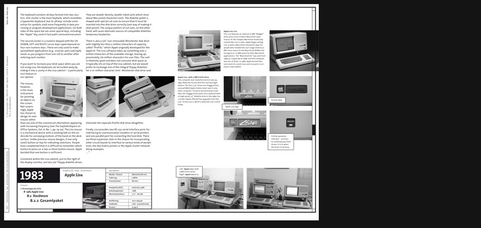
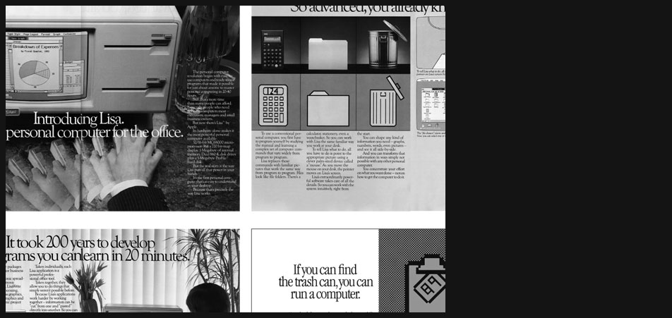
Apple Lisa Hardware
" ...
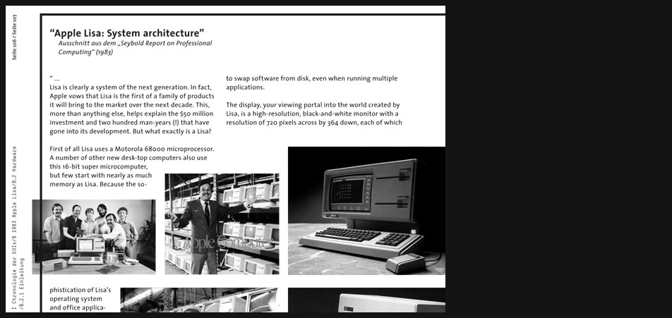
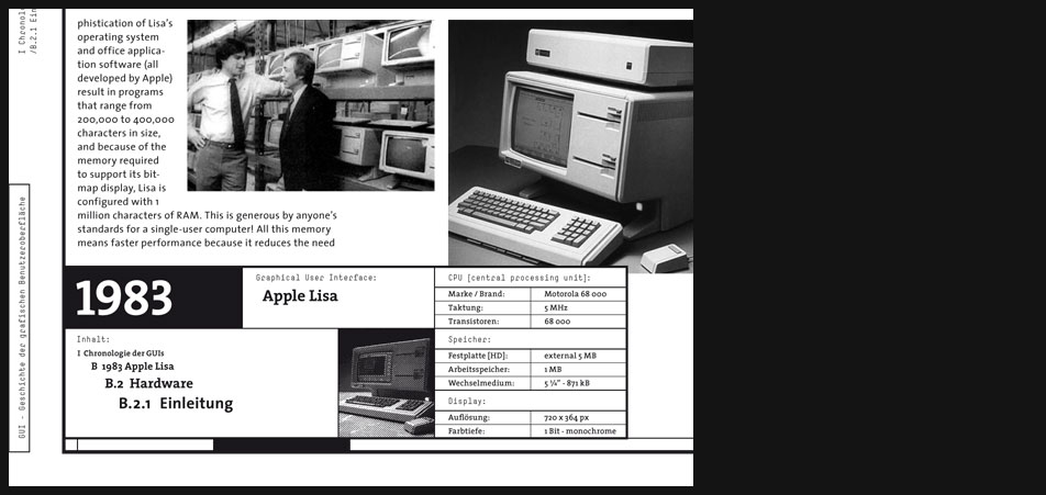
Lisa is clearly a system of the next generation. In fact, Apple vows that Lisa is the first of a family of products it will bring to the market over the next decade. This, more than anything else, helps explain the $50 million investment and two hundred man-years (!) that have gone into its development. But what exactly is a Lisa? First of all Lisa uses a Motorola 68000 microprocessor. A number of other new desk-top computers also use this 16-bit super microcomputer, but few start with nearly as much memory as Lisa. Because the sophistication of Lisas operating system and office application software (all developed by Apple) result in programs that range from 200,000 to 400,000 characters in size, and because of the memory required to support its bit-map display, Lisa is configured with 1 million characters of RAM. This is generous by anyones standards for a single-user computer! All this memory means faster performance because it reduces the need to swap software from disk, even when running multiple applications. ..."
Excerpt from the "Seybold Report on Professional Computing (1983)" -
Apple Lisa Hardware
Page 2 zoomed in
-
Apple Lisa Hardware
Page 2 zoomed in
-
Apple Lisa Hardware
Analogically to the Xerox Star Apple's Lisa is once again a system that is designed from the very beginning as a complete solution that is to say both the software and hardware are synchronized and/or optimized respectively.
-
Apple Lisa Hardware
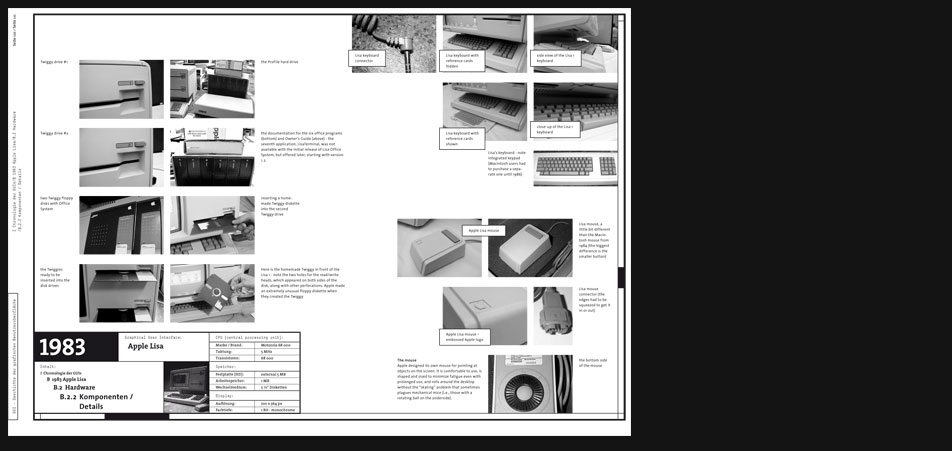
The design is very unique but despite its special almost vanguard character it is pretty consistent. The display, the mouse and the keyboard seem to belong together. Besides it has some neat details and effects, e.g. "... if you want to increase your desk space when you are not using Lisa, the keyboard can be tucked away by sliding it into a cavity in the Lisa cabinet..."
-

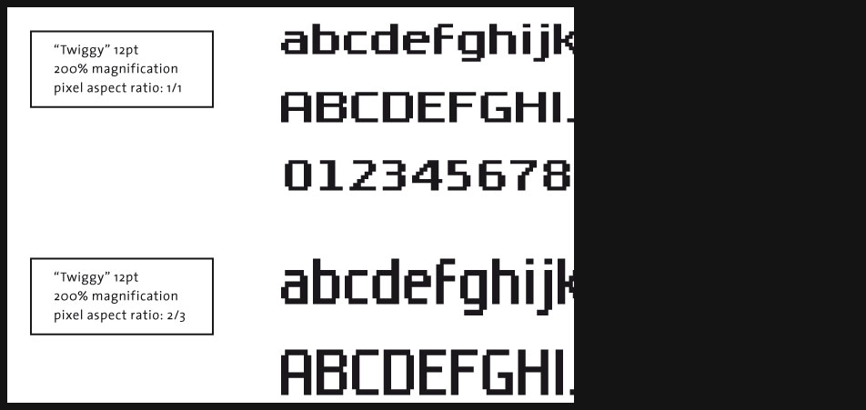
Apple Lisa Typography
Lisa uses some almost funny display fonts. On a modern display with a 'square pixel aspect ratio' they appear somehow 'fat' and low but on the exotic Lisa display with its special '2:3 pixel aspect ratio' they cut a fine figure.
-
Apple Lisa Typography
Page 7 zoomed in
-
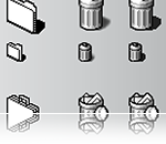
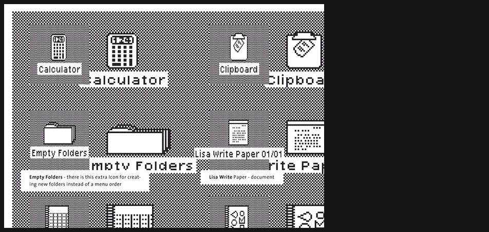
Apple Lisa Icons
"All icons, buttons and GUI elements in Apple Lisa Office System are glyphs in special system fonts, and are drawn internally just like regular text."
"The original trash can for Apple Lisa was supposed to have been an old, beat up alley trashcan, with the lid half open, flies buzzing around it and appropriate sounds as user put something inside."
http://www.guidebookgallery.org/extras/trivia
... Next in line was Lisa, Apples ill-fated office computer. Lisas desktop icons were somewhat similar to those of the Xerox Star Information System, although more detailed the trashcan had ribs and a cover, calculator digits, etc. The icons were also black and white, but of a slightly smaller resolution 48 pixels per 24 pixels. This was due to Lisa having lower screen resolution than Xerox Star, and also non-square pixels. ...
"One thousand square pixel of canvas" by Marcin Wichary -
Apple Lisa Icons
Page 9 zoomed in
-
Apple Lisa Icons
As I already explained in the 'display fonts section' every visual element for the Lisa had to be designed with the ulterior motive of the exotic 2:3 pixel aspect ratio. Here you can observe 200% magnified icons with square pixels and their 100% 'Lisa version'.
-
Apple Lisa Windows
"...
The window has a precise organization which is fairly independent of whatever is being shown in it. The bar spanning the top of the window contains an icon of this object and its name tag. Down the right side and bottom edge of the window are the scrolling column and bar respectively. The lower right-hand corner of the window contains a box with a corner icon. This can be tugged down and to the right to expand the size of the window to reveal more information. As a more general statement, you are completely free to adjust the window to any size the screen permits, whether to make the window tall and narrow, shallow and wide, or tall and wide.
The entire window can be moved around as a unit by moving the mouse to the icon title bar at the top, pressing and holding the button while moving the window to the desired location, and then releasing the button to drop the window on the desk-top. If the window is displaying other icons (which would be the case if it were showing the contents of a file storage device or file folder), the revealed icons can themselves be selected and opened into still other windows. ..."
Excerpt from the "Seybold Report on Professional Computing (1983)" -
Apple Lisa Windows
Page 12 zoomed in
-
Apple Lisa Windows
"...
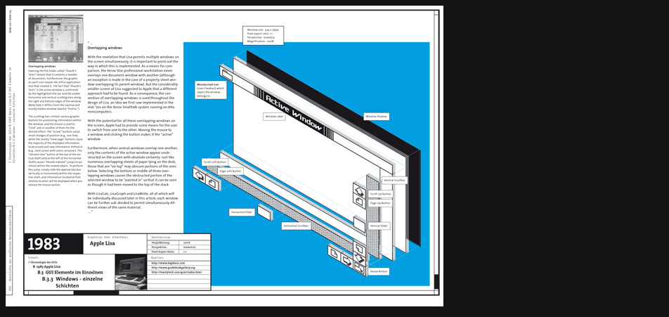
Overlapping windows
With the revelation that Lisa permits multiple windows on the screen simultaneously, it is important to point out the way in which this is implemented. As a means for comparison, the Xerox Star professional workstation never overlaps one document window with another (although an exception is made in the case of a property sheet window overlapping its parent window). But the considerably smaller screen of Lisa suggested to Apple that a different approach had to be found. As a consequence, the convention of overlapping windows is used throughout the design of Lisa, an idea we first saw implemented in the mid-70s on the Xerox Smalltalk system running on Alto minicomputers.
With the potential for all these overlapping windows on the screen, Apple had to provide some means for the user to switch from one to the other. Moving the mouse to a window and clicking the button makes it the active window.
Furthermore, when several windows overlap one another, only the contents of the active window appear unobstructed on the screen with absolute certainty. Just like numerous overlapping sheets of paper lying on the desk, those that are on top may obscure portions of the ones below. Selecting the bottom or middle of three overlapping windows causes the obstructed portion of the selected window to be painted in so that it can be seen as though it had been moved to the top of the stack. ..."
Excerpt from the "Seybold Report on Professional Computing (1983)" -
Apple Lisa Windows
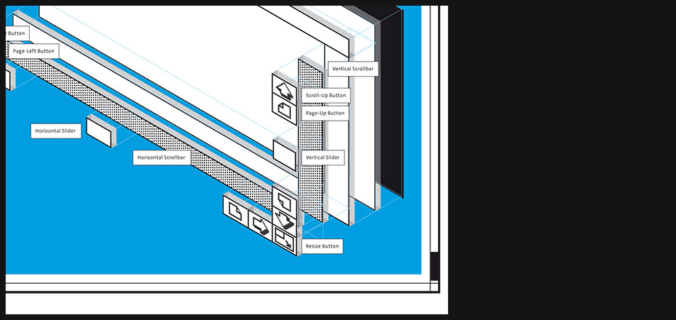
Lisa window split into individual layers emphasizing threedimensional user controls
-
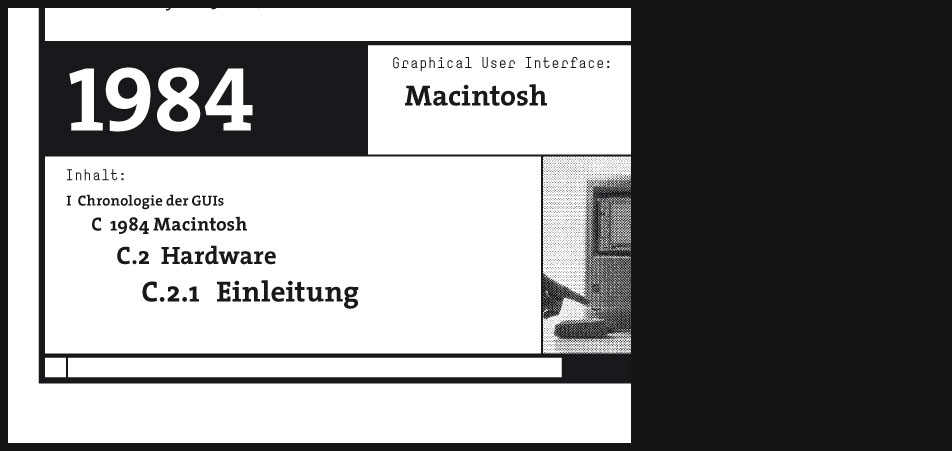
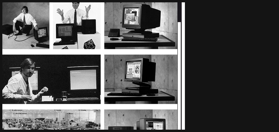
1984 Macintosh
"...
With the Macintosh, Apple has added a new dimension to computing. Based on the concept of a desktop working environment, the Mac allows you to do more with a personal computer and more importantly, do it more easily and naturally than ever before.
Imagine driving a car that has no steering wheel, accelerator, brake pedal, turn signal lever, or gear selector. In place of all the familiar manual controls, you have only a typewriter keyboard.
Any time you want to turn a corner, change lanes, slow down, speed up, honk your horn, or back up, you have to type a command sequence on the keyboard. Unfortunately, the car cant understand English sentences. Instead, you must hold down a special key with one finger and type in some letters and numbers, such as S20:TL:A35, which means, Slow to 20, turn left, and accelerate to 35.
If you make typing mistakes, one of three things will happen. If you type an unknown command, the car radio will bleat and you will have to type the command again. If what you type happens to be wrong but is nevertheless a valid command, the car will blindly obey (Imagine typing A95 instead of A35.) If you type something the manufacturer didnt anticipate, the car will screech to a halt and shut itself off.
No doubt you could learn to drive such a car if you had sufficient motivation and determination. But why bother, when so many cars use familiar controls? Most people wouldnt.
Most people dont bother to use a personal computer for the same reasons they wouldnt bother with a keyboard-controlled car. Working on a computer isnt a natural skill, and the benefits hardly seem worth the hassle of learning how to get work done in an unfamiliar environment. If you make a typing mistake, the computer may do nothing, tell you it doesnt understand, do the wrong thing, shut itself down, or destroy all the work youve done and then shut itself down. Who cares if the machine is theoretically thousands of times more efficient than pencil and paper? If using the machine rattles you so much that you cant get anything done, it is in fact less efficient and may waste more time than it saves.
What if a computer could let you work in a familiar environment, similar to the way you work at your desk? You could put things you wanted to work with on top of the desk, move them around, put documents into folders or files, and even throw things into the trash. This description accurately fits the working environment of Apples Macintosh computer. The things you work with on your desk appear not as words and numbers in regimented lines, but as graphic objects located on the Mac screen. ..."
from the paper "A tour of the Mac desktop from Macworld 1984" -
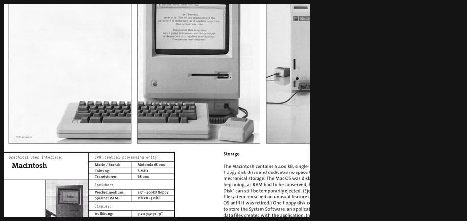
Macintosh Hardware
"...
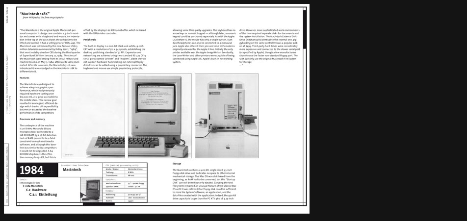
The Macintosh is the original Apple Macintosh personal computer. Its beige case contains a 9-inch monitor and comes with a keyboard and mouse. An indentation in the top of the case allows the computer to be lifted and carried. It had a selling price of US$2,495. The Macintosh was introduced by the now famous US$1.5 million television commercial by Ridley Scott, 1984, that most notably aired on CBS during the third quarter of Super Bowl XVIII on January 22, 1984. The sales of the Macintosh were strong from its initial release and reached 70,000 on May 3, 1984; afterwards sales plummeted. After its successor, the Macintosh 512K, was introduced it was rebadged as the Macintosh 128K to differentiate it. ..."
from Wikipedia, the free encyclopedia -
Macintosh Hardware
Page 2 zoomed in
-
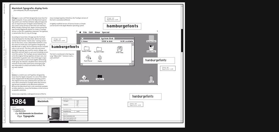
Macintosh Typography
"...
Chicago is a sans-serif font designed by Susan Kare for Apple Computer. It was used in the Macintosh operating system user interface between 1984 and 1997 and was an important part of Apples brand identity. It is also used in early versions of the iPod user interface. While initially a bitmap font, Apple commissioned the type foundry Bigelow & Holmes to create a TrueType version, as the OSs capabilities improved. The typeface is named after the U.S. city of Chicago.
According to Susan Kare, Chicago was the first font to be developed for the Macintosh. Before the team settled on the familiar world cities naming convention for the fonts, it was called Elefont (Elefont is also the name of a bold semi-serif typeface designed by Bob McGrath in 1978). The first bitmap version included only a 12 pt version. This font, with only very minor changes to spacing, was used for menus, dialogs, window titles and text labels in up to and including version 7.6 of the system. The TrueType version looked identical to the original bitmap typeface at lower sizes, but scaled better to greater sizes. One of Chicagos major features was that it could remain legible while being made grey (to indicate a disabled menu item) by the removal of every other pixel (since actual grey type was impossible on a black-and-white monitor). The zero was slashed. ...
...
Geneva is a realist sans-serif typeface designed by Susan Kare for Apple Computer. It is one of the oldest fonts shipped with the Macintosh operating system. The original version was a bitmap font, but later versions were converted to TrueType when that technology became available on the Macintosh platform. Because this Macintosh font is not commonly available on other platforms, many find Verdana or Arial to be an acceptable substitute. Geneva was originally a redesigned version of the famous Linotype typeface Helvetica; the TrueType version of the font is somewhat different. A slightly modified version of Geneva known as Simple can be found in the Apple Newton operating system. The font is mentioned in the Figurine song IMpossible: Genevas such a cold cold font. ...
from Wikipedia, the free encyclopedia -

Macintosh Typography
Page 4 zoomed in
-
Macintosh Icons
"...
The Mac desktop, being somewhat smaller than the average desk it models, doesnt have room enough for life-sized objects. At first, objects appear on the Mac desktop as small pictures called icons. On the Mac, an icon is a symbol for some concept or object. For example, when you switch on the Mac and insert a disk, the screen shows two disk-shaped icons and a trash can. As a graphic image, an icon can remind you about what it represents better than words alone.
Each icon represents a specific collection of information. To avoid ambiguity, icons also have labels. The disk icon (labeled Write/Paint in Figure 1) represents the documents and programs stored on the disk inserted into the Macs disk drive. The dimmed disk icon labeled Alternate Disk is used for copying files from one disk to another, and the trash can icon labeled Trash holds documents and programs waiting to be purged from the disk. ...
"A tour of the Mac desktop" from Macworld 1984 -
Macintosh Icons
Page 6 zoomed in
-
Macintosh Windows
"...
When you want to look at the information that one of the icons represents, you open a window. To open the disk icon, for example, you first select the icon by clicking the mouse button while the pointer is over the disk icon. The icon is highlighted to confirm that you have selected it. Next, you choose the Open command from the File menu. An outline zooms out of the icon and the screen almost fills up with a rectangular window containing icons that represent the documents and programs on the disk. The selected icon becomes hollow (all white) to show that you have opened it, and the disk icons name appears in a title bar at the top of the window. The line below the title bar gives information including the number of files, the amount of disk space they take up, and the amount of disk space available.
A more efficient way to open an icon is to double-click the mouse button (quickly press and release it twice); this action selects the icon and opens a window.
Some of the icons represent folders that can contain other programs and documents, similar to file folders on your office desk that combine separate files. You can see the contents of a folder by selecting and opening that folder. A new window will appear on the desktop, displaying the icons that represent the files stored in the folder (see Figure 5). You can store folders within folders and use them to organize your files so that windows dont get cluttered with too many documents.
The Mac lets you open several windows simultaneously. Select another icon, choose the Open command from the File menu or double-click on the selected icon, and another window zooms into existence. Each new window you open overlaps the existing windows. You may see the edges of existing windows sticking out underneath the new window, or the new window may completely hide everything under it. Windows can also cover up the icons on the Mac desktop.
The window on top, or frontmost window, is called the active window. You can bring any window to the top and make it the active window by putting the pointer anywhere on it (even an edge thats sticking out behind another window) and clicking the mouse button. You can remove the active window from the Mac desktop by choosing the Close command from the File menu. The icon that the window came from sucks the information back, the window disappears, and the icon resumes its normal appearance.
You can also move windows around on the Mac desktop. If you place the pointer over the title bar of a window, press and hold down the mouse button, and slide the mouse, a flickering outline of the window is dragged on the desktop. Let go of the mouse button, and the window jumps to the new location. When you move a window by this method, it becomes the topmost window. However, holding down the key while you drag a window allows you to move the window without disturbing its relative position in the pile. This feature is an example of an advanced desktop management skill that you soon learn after a few work sessions with the Mac. Sometimes windows get buried. Unfortunately, theres no way to get a side view of the Mac desktop to see what might be under the frontmost window. But you can always relocate windows or change their sizes to uncover the ones underneath. ..."
"A tour of the Mac desktop" from Macworld 1984 -
Macintosh Windows
Page 8 zoomed in
-
Macintosh Windows
"...
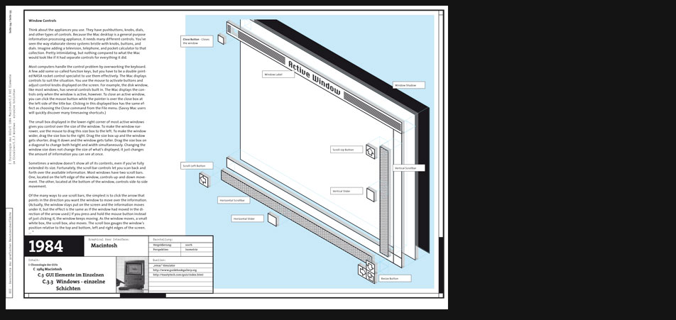
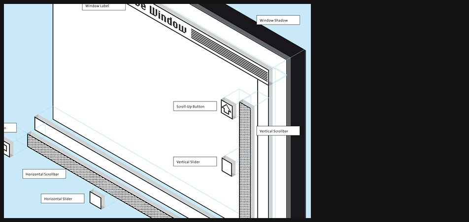
Window Controls
Think about the appliances you use. They have pushbuttons, knobs, dials, and other types of controls. Because the Mac desktop is a general purpose information processing appliance, it needs many different controls. Youve seen the way elaborate stereo systems bristle with knobs, buttons, and dials. Imagine adding a television, telephone, and pocket calculator to that collection. Pretty intimidating, but nothing compared to what the Mac would look like if it had separate controls for everything it did.
Most computers handle the control problem by overworking the keyboard. A few add some so-called function keys, but you have to be a double-jointed NASA rocket control specialist to use them effectively. The Mac displays controls to suit the situation. You use the mouse to activate buttons and adjust control knobs displayed on the screen. For example, the disk window, like most windows, has several controls built in. The Mac displays the controls only when the window is active, however. To close an active window, you can click the mouse button while the pointer is over the close box at the left side of the title bar. Clicking in this displayed box has the same effect as choosing the Close command from the File menu. (Savvy Mac users will quickly discover many timesaving shortcuts.)
The small box displayed in the lower-right corner of most active windows gives you control over the size of the window. To make the window narrower, use the mouse to drag this size box to the left. To make the window wider, drag the size box to the right. Drag the size box up and the window gets shorter; drag it down and the window gets taller. Drag the size box on a diagonal to change both height and width simultaneously. Changing the window size does not change the size of whats displayed, it just changes the amount of information you can see at once.
Sometimes a window doesnt show all of its contents, even if youve fully extended its size. Fortunately, the scroll bar controls let you scan back and forth over the available information. Most windows have two scroll bars. One, located on the left edge of the window, controls up-and-down movement. The other, located at the bottom of the window, controls side-to side movement.
Of the many ways to use scroll bars, the simplest is to click the arrow that points in the direction you want the window to move over the information. (Actually, the window stays put on the screen and the information moves under it, but the effect is the same as if the window had moved in the direction of the arrow used.) If you press and hold the mouse button instead of just clicking it, the window keeps moving. As the window moves, a small white box, the scroll box, also moves. The scroll box gauges the windows position relative to the top and bottom, left and right edges of the screen. ..."
"A tour of the Mac desktop" from Macworld 1984 -
Macintosh Windows
Page 10 zoomed in
-
1989 NeXT
"...
Intro to NEXTSTEP
So there it is. Apple has decided to buy NeXT Software, Inc., and make NEXTSTEP the basis next MacOS.
The average Mac user is probably scratching his head and saying "NEXTSTEP? I thought NeXT was out of business."
Not so. In fact, the NEXTSTEP operating system is alive and well, and it was the best selection Apple could have made for the next MacOS. In this Intro to NEXTSTEP I will outline why this was such a good move, and provide lots of screenshots of NEXTSTEP in action. First, a brief explanation of what NEXTSTEP is.
So, what is this NEXTSTEP, anyway?
NEXTSTEP is the operating system of the long-dead NeXT computer. Back when NeXT Software was called NeXT Computer, they made a wonderful black machine that ran NEXTSTEP. After years of dismal sales, NeXT dropped the hardware (1993), but continued to sell the operating system while developing many more products (EOF, PDO, WebObjects).
NEXTSTEP is based on an operating system called Mach (to which NeXT has added a UNIX interface, so you can the UNIX command line if you like), but unlike your average UNIX system, NEXTSTEP is not hard to use. On the contrary, NEXTSTEP is a users dream come true. NEXTSTEP is to the Mac interface what the Mac is to Windows 3.1. Its that much better. ..."
"Intro to NeXTSTEP" by Thomas McCarthy -
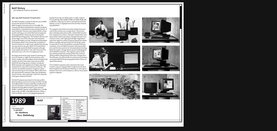
NeXT Hardware
"...
The NeXT Computer was based on the new 25 MHz Motorola 68030 central processing unit (CPU). The Motorola 88000 RISC chip was originally considered, but was not available in sufficient quantities. It included between 8 and 64 MB of random access memory (RAM), a 256 MB magneto-optical (MO) drive, a 40 MB (swap-only), 330 MB, or 660 MB hard drive, 10Base-2 Ethernet, NuBus and a 17-inch MegaPixel grayscale display measuring 1120 by 832 pixels. In 1989, a typical PC included 640 KB to 4 MB of RAM, the 8086, 8088, 286 or 386 CPU, a 640x350 16-color or 720x348 monochrome display, a 10 to 20 megabyte hard drive and few networking capabilities. ..."
from Wikipedia, the free encyclopedia -
NeXT Hardware
Page 2 zoomed in
-

NeXT Typography
Unfortunately I must admit that similar to the Xerox Star I couldn't find NeXT's display fonts yet. Until this very moment it was even impossible for me to find the font's name. Of course I will refresh my research on that area one day and hopefully find more input about this case in the end.
-
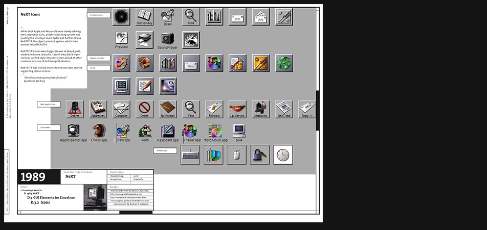
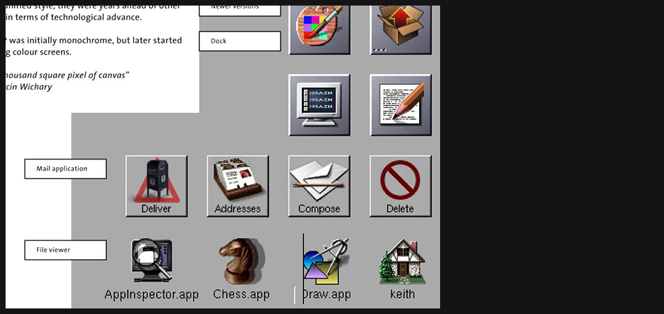
NeXT Icons
"...
While both Apple and Microsoft were slowly refining their respective GUIs, another operating system was pushing the envelope much faster and further. It was NeXTSTEP, the object-oriented system, which later evolved into OPENSTEP. NeXTSTEPs icons were bigger (drawn at 48x48 grid), shaded and more colourful. Even if they didnt represent one unified style, they were years ahead of other creations in terms of technological advance. NeXTSTEP was initially monochrome, but later started supporting colour screens. ..."
"One thousand square pixel of canvas" by Marcin Wichary -
NeXT Icons
Page 5 zoomed in
-
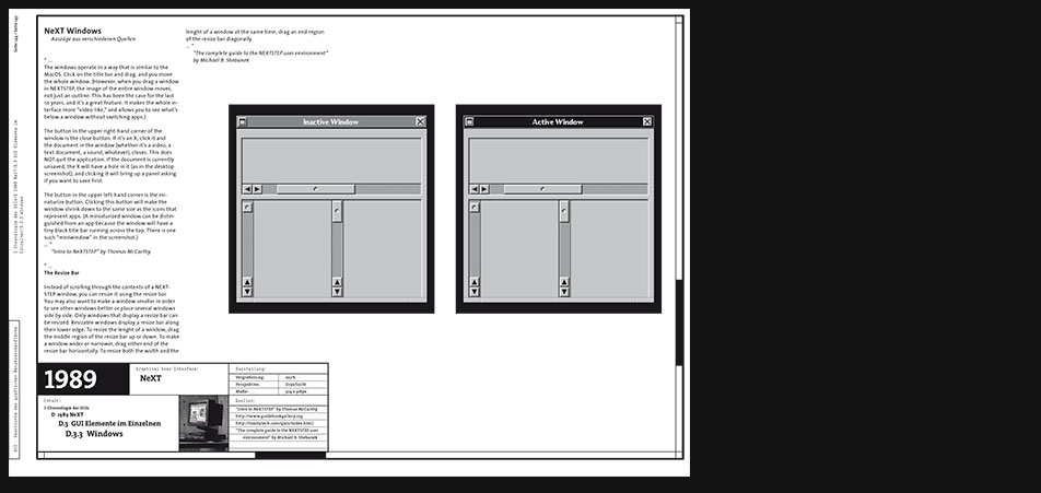
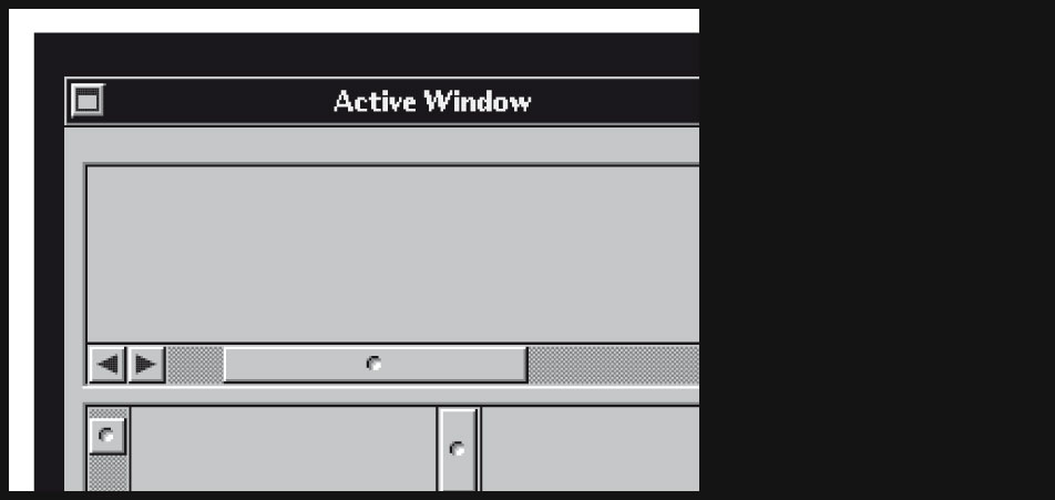
NeXT Windows
"...
The windows operate in a way that is similar to the MacOS. Click on the title bar and drag, and you move the whole window. (However, when you drag a window in NEXTSTEP, the image of the entire window moves, not just an outline. This has been the case for the last 10 years, and its a great feature. It makes the whole interface more video-like, and allows you to see whats below a window without switching apps.)
The button in the upper right-hand corner of the window is the close button. If its an X, click it and the document in the window (whether its a video, a text document, a sound, whatever), closes. This does NOT quit the application. If the document is currently unsaved, the X will have a hole in it (as in the desktop screenshot), and clicking it will bring up a panel asking if you want to save first.
The button in the upper left-hand corner is the minaturize button. Clicking this button will make the window shrink down to the same size as the icons that represent apps. (A miniaturized window can be distinguished from an app because the window will have a tiny black title bar running across the top. There is one such miniwindow in the screenshot.) ...
"Intro to NeXTSTEP" by Thomas McCarthy
"...
The Resize Bar Instead of scrolling through the contents of a NEXTSTEP window, you can resize it using the resize bar. You may also want to make a window smaller in order to see other windows better or place several windows side by side. Only windows that display a resize bar can be resized. Resizable windows display a resize bar along their lower edge. To resize the lenght of a window, drag the middle region of the resize bar up or down. To make a window wider or narrower, drag either end of the resize bar horizontally. To resize both the width and the lenght of a window at the same time, drag an end region of the resize bar diagonally. ..."
"The complete guide to the NEXTSTEP user environment" by Michael B. Shebanek -
NeXT Windows
Page 7 zoomed in
-
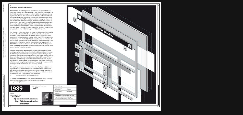
NeXT Windows
"...
Attention to Details: A NeXT Hallmark
NEXTSTEP has the richest graphical user interface (GUI) available today. There is so much to say, I wont even try. ... First, the (vertical) scrollbar is on the left. Because the menu appears on the left, this saves the user time going between the two. (The scrollbars really should be on the left in the MacOS and Windows, too, considering that the most often used menu items are also towards the left.) The fact that most text in any given document will be on the left of the window is yet another reason for the scrollbar to be on the left, since that is the side of the window the cursor is most likely to be during editing. In addition, the left-side scrollbars mean that a window can be fully functional when part of it is off-screen to the right. Send the right side of a window off-screen in MacOS or Windows, and while you can get to the menus and buttons, you wont be able to scroll.
The scrollbars length depends on the size of the document being displayed in the window. If most of the document is already in the window, the scrollbar is almost the length of the window. If only a tiny portion of the document is in the window, the scrollbar will be tiny. (This resizing scrollbar is still missing from the MacOS, where the scrollbar gives no indication of the documents size. Windows 95 has this feature, but does it wrong: if the document is really big, the scrollbar becomes too small to grab easily. In NEXTSTEP, the scrollbar will never get smaller than that little dimple and some space above and below it, which is considerably larger than the smallest the Windows scrollbar can get.)
Speaking of the dimple, whats it there for? Well, click somewhere in the scrolling area, but not on the scrollbar itself, and the scrollbar will move so that the dimple appears directly under your mouse (from there, you may then scroll some more, without having to click your mouse again to grab the bar, provided you havent released the mouse button). This is useful when navigating around in large documents. (In Windows and MacOS, all you get by clicking below or above the scrollbar is one screenful of movement, which can make navigation painfully slow. If you want just one screenful of scrolling in NEXTSTEP, alternate-click a scrolling arrow.)
The scrolling arrows also deserve mention. First off, the up and down are right next to each other, so if you scroll just a bit too far in one direction, you dont have to mouse up to the other end of the scrollbar to go back a bit. Second, any horizontal scrolling arrows will also be in the same corner as the vertical ones, saving the user even more time. ..."
"Intro to NeXTSTEP" by Thomas McCarthy
"...
For left handed people this kind of makes more sense, and it is usually easier to keep your eye on the scroll bar while reading text. ..."
from toastytech.com -
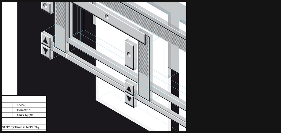
NeXT Windows
- Page 9 zoomed in
- Window's layers and user controls made visible in isometric perspective
-
1990 Windows 3
"...
Windows 3.0 is the third major release of Microsoft Windows, and was released on 22 May 1990. It became the first widely successful version of Windows and a powerful rival to Apple Macintosh and the Commodore Amiga on the GUI front. It was followed by Windows 3.1. ..."
wikipedia.org
"...
About this time Microsoft finally realized that the GUI was catching on. Functionally, the window management is not much different than version 2.x, however they took some steps to make it look fancier. Command buttons and the window controls now have a 3D look. However this 3Dnes did not extend to many other window controls. Microsoft replaced the old MS-DOS Executive with Program Manager and its companion, File Manager. Program manager gives the user large Macintosh like icons to click on to start programs. Although program groups can not be imbedded in other program groups, the icons are drag and dropable between groups. On the technical side, Windows 3.0 is capable of running in 8086 real mode (640k limit), 286 standard mode (~16 meg limit using XMS), and 386 enhanced mode which also allows page swapping (hard drive space is the limit). Windows 3.0 is the last version of Windows that will run on 8088/8086 IBM PC compatibles ..."
toastytech.com -

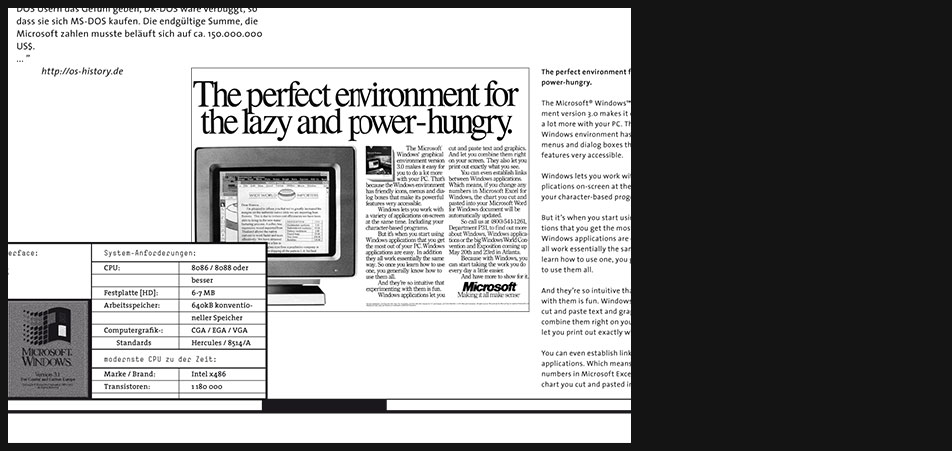
Windows 3 Hardware H H H System Requirements CPU 8086 / 8088 or better Hard Disk 6-7 MB Memory 640kB conventional memory Computer Graphics CGA / EGA / VGA Hercules / 8514/A best CPU at that time Brand: Intel x486 Transistor Amount: 1 180 000 Description Image content description
On this layout from my documentation you can see some old advertising glorifing the possibilites of Windows 3 and the current state-of-the-art hardware technology.
-
Windows 3 Hardware
Page 2 zoomed in
-
Windows 3 Hardware
"...
Features
...
The Windows icons and graphics were redesigned to take advantage of VGAs 16-color mode. Earlier versions only supported eight colors though could run on monochrome video adapters. Windows 3.0 also allowed the user to use a 256 color video adapter, whereas previous versions only supported 16 colors.
Windows 3.0 includes a Protected/Enhanced mode which allows Windows applications to use more memory in a more painless manner than their DOS counterparts could. It can run in any of Real, Standard, or 386 Enhanced modes, and is compatible with any Intel processor from the 8086/8088 up to 80286 and 80386. Windows 3.0 tries to auto detect which mode to run in, although it can be forced to run in a specific mode using the switches: /r (real mode), /s (standard 286 protected mode) and /3 (386 enhanced protected mode) respectively. This was the first version to run Windows programs in protected mode, although the 386 enhanced mode kernel was an enhanced version of the protected mode kernel in Windows/386.
Due to this backward compatibility, Windows 3.0 applications also must be compiled in a 16-bit environment, without ever using the full 32-bit capabilities of the 386 CPU.
Marketing
This version of Windows was the first to be pre-installed on hard drives by PC-compatible manufacturers. Zenith Data Systems had previously shipped all of its computers with Windows 1.0 or later 2.x on diskettes but committed early in the development of Windows 3.0 to shipping it pre-installed. Indeed, the Zenith division had pushed Microsoft hard to develop the graphical user interface because of Zeniths direct competition with Apple in the college & university market. ..."
en.wikipedia.org -
Windows 3 Hardware
Page 4 zoomed in
-
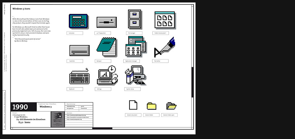
Windows 3 Icons
Article excerpt:
"...
While Microsoft put the hideous icons from Windows 1.0 also in the second edition of their soon-to-be flagship product, they wouldnt repeat that mistake again.
For Windows 3.0, Microsoft hired no other than Susan Kare herself, who added style and substance to the previously neglected icons. Still at 32x32, the icons now sported 16 colours, had consistent shadows and were vastly improved visually. ..."
"One thousand square pixel of canvas" by Marcin Wichary -

Windows 3 Icons
Page 6 zoomed in
-
Windows 3 Windows
"...
seit Windows 2.x konnte man an allen Fensterecken ziehen, um das Fenster beliebig zu skalieren. Also egal ob links oben, rechts unten oder die anderen beiden Ecken.
... Ganz rechts ist der Maximieren-Button, wenn man darauf klickt füllt das Fenster den gesamten Bildschirm, natürlich ändert der Button sich dann zum Minimieren Button (maximiert). Links daneben ist der minimieren Button, weil es damals noch keine Taskleiste gab, hat sich das Fenster auf ein kleines Symbol unten auf dem Bildschirm verkleinert (minimiert).
Das Menü ganz links (siehe Ausgangssituation) hat alle Optionen nochmal zusammengefasst, Restore stellt die Originalfenstergröße wieder her, nachdem man es maximiert hat, Move verschiebt das Fenster, Size verändert die Größe, Minimize/Maximize sind klar, Close schließt es und Switch to springt in den Unterfenstern rum, also wenn man den File Manager geöffnet hat, und dann Ctrl+Esc drückt, springt die Markierung vom Main Fenster zu den Symbolen unten, die je ein anderes Fenster darstellen (Accessories, Games, StartUp, Applications). ..."
aus der Korrespondenz mit dem os-history.de moderator -
Windows 3 Windows
Page 8 zoomed in
-
1995 Windows 95
"...
What Microsoft is attempting to do is introduce a concept that has been used in the auto industry for decades the model year. When you look at Windows 95, what is the most noticeable change from Windows 3.1? Its the new user interface. Buy one of those bonus disks and you have car options. Two-tone paint, leather interior.
If you look at the history of the automobile, you see that once the automatic transmission was invented, not much that was fundamental has changed in the car. Blinking turn signals and windshield-wiper speed control may be cited, but these are minor compared with the most noticeable change from year to year: body and interior design. Look at a 1935 Plymouth and a 1995 Lexus side by side. You can get to the store and back in about the same amount of time. But whats really different? Its not the functionality but the design.
This is exactly what we are about to see in software. The profit in car manufacture has never been maximized by selling to that fellow down the street who has the mint-condition 1949 Buick that he still drives every day. If everyone were like that geezer, there wouldnt be much of a car market, would there? No money would be made in software if people didnt have an impetus to buy new versions of old software.
Well, taking a page from Detroits notebook may not be a bad idea. Why not redo the operating system yearly, just like a car model? Just keep changing it, based more on aesthetics than innards. There is a big difference between the 32-valve V8 in a Lexus and an old flathead Ford V8, but only hot-rodders and enthusiasts really care. ..."
from PC Magazine, October 24, 1995, pp. 89 -
Windows 95 Hardware
"...
Windows 95 (interner Codename in der Entwicklungsphase: Chicago) ist ein 1995 von Microsoft publiziertes Betriebssystem, das weiterhin auf MS-DOS beruht, aber eine verbesserte Benutzeroberfläche aufweist, die zum größeren Teil 32-Bit-Technik verwendet.
...
Damit läutete Microsoft in der breiteren Masse das Ende der veralteten 16-Bit-Technologie ein. Im 16-Bit Modus der x86-Linie läuft unter anderem das Betriebssystem DOS, sowie die ersten Versionen von Windows bis einschließlich 3.x. Windows 95 setzt, ebenso wie dessen Nachfolger 98 und ME, weiterhin auf DOS auf, welches zum Starten und für wichtige Systemprozesse und Treiber benötigt wird. ... Zwar verfügt Windows 95 bei 32-Bit-Anwendungen über präemptives Multitasking, aber wegen eingeschränkten Speicherschutzes kann eine Applikation immer noch das ganze System blockieren. Mit 16-Bit-Anwendungen ist nach wie vor kein präemptives Multitasking möglich. Microsoft begann die größte Produkteinführung der Konzerngeschichte.
Die für Windows 95 eigens komponierte Startmelodie wurde 1994 von Brian Eno auf einem Apple Macintosh erschaffen.
Windows 95 ist nach Windows NT 3.1 (das erste NT, hat die Benutzeroberfläche von Windows 3.x) das erste Microsoft-Betriebssystem, das zum größeren Teil auf der auch heute noch benutzten 32-Bit-Architektur basiert und diese der breiten Masse eröffnete, nachdem sich IBM mit OS/2, das diese Technik schon längere Zeit beherrschte, auf dem Markt gegen Windows nicht durchsetzen konnte. Erstaunlich dabei war, wie Microsoft es schaffte die beiden Welten DOS und 32-bit Windows in einer Art Symbiose für den Anwender zu vereinen.
...
Umfangreich sind auch die Neuerungen im grafischen Bereich, allen voran das Windows-Startmenü. Microsoft hat mit Windows 95 eine Benutzeroberfläche geschaffen, die ähnlich wie vorher schon bei dem zu Beginn gemeinsam mit IBM entwickelten Betriebssystem OS/2 zu bedienen ist. Auch die Taskleiste am unteren Rand des Bildschirms war unter Windows neu. ... Der alte Programm-Manager aus Windows 3.1 wurde ersetzt durch den so genannten Desktop, eine Oberfläche, auf der sich mit entsprechenden Anwendungen verknüpfte Symbole befinden.
Der von Windows 3.x bekannte Datei-Manager wurde durch den neuen Explorer ersetzt. Neben der eigentlichen Dateiverwaltung ist er auch für die Symbole (auf dem Desktop), die Fenster, die Taskleiste und einiges mehr zuständig. Neu für Windows sind auch die Kontextmenüs. So kann man praktisch alles mit der rechten Maustaste anklicken, um zu sehen, welche Aktionen man auf dem jeweiligen Objekt durchführen kann, so zeigen sich beispielsweise Unterschiede der möglichen Aktionen im Kontextmenü zwischen Text-Dateien und etwa Word-Dokumenten. Unter Windows 3.x ist die rechte Maustaste im Gegensatz zu vielen Anwendungsprogrammen, beispielsweise WordPerfect meist ohne Funktion.
Windows 95 brachte nicht nur Neuerungen, sondern auch Probleme mit sich. Das beginnt mit Kompatibilitätsproblemen zu Windows 3.11 und DOS und endete bei Stabilitätsproblemen und zufällig auftretenden Fehlermeldungen. In Sachen Stabilität reicht Windows 95 bei weitem nicht an Windows 3.11 oder an Windows-Versionen der NT-Linie heran.
Durch die Unterstützung sowohl von alten 16-Bit- als auch von neuen 32-Bit-Programmen wurde der Kernel signifikant komplizierter als bei der Vorgängerversion 3.1x, was in deutlich geringerer Ausführungsgeschwindigkeit - insbesondere beim Bildschirmaufbau - resultiert. ...
Microsoft hat die Unterstützung des Betriebssystems am 31. Dezember 2001 auch für Unternehmen eingestellt, seitdem gibt es auch keine Sicherheitsupdates mehr. Für viele Nutzer war Windows 95 aber noch darüber hinaus unverzichtbar. ..."
de.wikipedia.org -
Windows 95 Hardware
"...
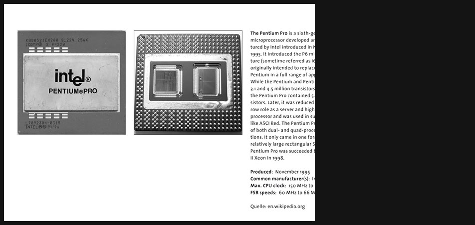
The Pentium Pro is a sixth-generation x86 microprocessor developed and manufactured by Intel introduced in November 1995. It introduced the P6 microarchitecture (sometime referred as i686) and was originally intended to replace the original Pentium in a full range of applications. While the Pentium and Pentium MMX had 3.1 and 4.5 million transistors, respectively, the Pentium Pro contained 5.5 million transistors. Later, it was reduced to a more narrow role as a server and high-end desktop processor and was used in supercomputers like ASCI Red. The Pentium Pro was capable of both dual- and quad-processor configurations. It only came in one form factor, the relatively large rectangular Socket 8. The Pentium Pro was succeeded by the Pentium II Xeon in 1998. ..."
en.wikipedia.org -
Windows 95 Icons
"...
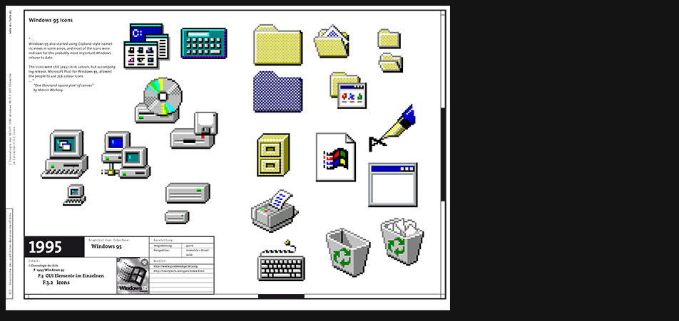
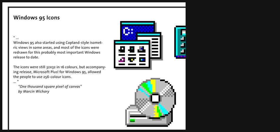
Windows 95 also started using Copland-style isometric views in some areas, and most of the icons were redrawn for this probably most important Windows release to date.
The icons were still 32x32 in 16 colours, but accompanying release, Microsoft Plus! for Windows 95, allowed the people to use 256-colour icons. ..."
"One thousand square pixel of canvas" by Marcin Wichary -
Windows 95 Icons
Page 4 zoomed in
-
Windows 95 Windows
"...
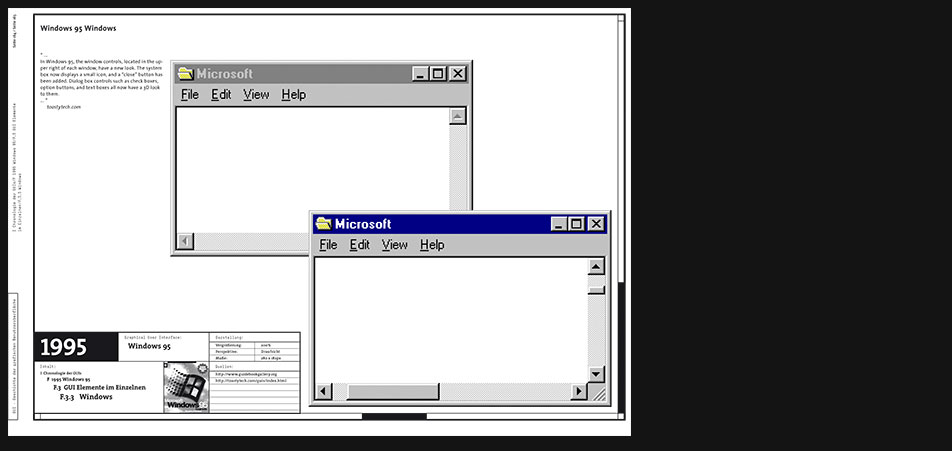
In Windows 95, the window controls, located in the upper right of each window, have a new look. The system box now displays a small icon, and a close button has been added. Dialog box controls such as check boxes, option buttons, and text boxes all now have a 3D look to them. ..."
toastytech.com -
Windows 95 Windows
Page 6 zoomed in
-
1999 Mac OS 9
"...
Mac OS 9 is the final major release of Apples Classic Mac OS. Introduced on October 23, 1999.
...
While Mac OS 9 lacks the functionality of a modern operating system, such as protected memory and full pre-emptive multitasking, lasting improvements include the introduction of an automated Software Update engine and support for multiple users. ..."
en.wikipedia.org
"...
Mac OS 9 wurde vor seiner Veröffentlichung in Entwicklerversionen als Mac OS 8.7 bezeichnet, und in der Tat sind die Änderungen, die Apple im Halbversionsschritt von 8.1 nach 8.5 vornahm, größer als diejenigen von 8.6 nach 9. Der Sprung in der Versionsnummer ist auch dadurch zu begründen, dass Apple für Mac OS X, die neue Generation des Betriebssystems, der 10 nahekommen wollte.
Die wichtigsten Neuerungen von Mac OS 9 waren Mehrbenutzerunterstützung und die Schlüsselbund-Funktion, mit der ein zentraler Aufbewahrungsort für Passwörter eingeführt wurde.
Nachdem bereits im Jahre 2000 die erste Version des Nachfolgers Mac OS X erschienen war, kündigte Apple-Chef Steve Jobs im Mai 2002 an, die Entwicklung von Mac OS 9 werde nicht mehr fortgeführt. Im Januar 2003 wurde der erste Power Mac verkauft, der nicht mehr Mac OS 9 booten konnte, die letzten OS-9-bootfähigen Macs wurden im Sommer 2004 verkauft. ..."
de.wikipedia.org
"...
MacOS 9.0 was released in October 1999 with the final update for it, version 9.2.2, release in December 2001. MacOS 9.2.2 is the last version of MacOS based on the original Macintosh operating system.
Over all the user interface is not much different from the MacOS 8.x desktop but there have been many technical improvements and some new features added. ..."
toastytech.com -
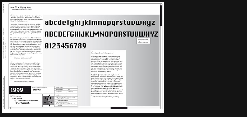
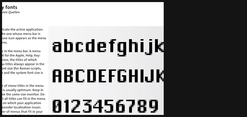
Mac OS 9 Typography
"...
The menu bar helps to indicate the active application. The active application is the one whose menu bar is currently showing and whose icon appears as the menu title of the Application menu.
The titles of menus appear in the menu bar. A menu title is a text string (except for the Apple, Help, Key-board, and Application menus, the titles of which contain a small icon). Menu titles always appear in the system font and system font size (for Roman scripts, the system font is Chicago and the system font size is 12).
You can insert any number of menu titles in the menu bar; however, less than 10 is usually optimum. Keep in mind that not all users have the same size monitor. Design your menu bar so that all titles can fit in the menu bar of the smallest screen on which your application can run. You should also consider localization issues when designing the number of menus that fit in your menu barnot all menu titles might fit in the menu bar once the menu titles are translated. For example, English text often grows 50 percent larger when translated to other languages. ..."
"Macintosh Toolbox Essentials"
"...
Menus created using the standard menu definition in the Macintosh Toolbox display menu items in the system font, which is 12-point Chicago in the Roman version of system software. The system font for the primary script system varies depending on the version of localized system software installed in the users computer when multiple script systems are installed. When a menu item is unavailable, it is displayed in gray letters. When a user moves the pointer over the dimmed item, it isnt highlighted. ..."
"Apple Human Interface Guidelines" -
Mac OS 9 Typography
"...
Currently used rasterization systems
Windows since Windows 98 has included a combination of font-level hinting and antialiasing. Font smoothing is also available as an installation file, released in 1997 for Windows 95. Since Windows XP, it has also supported subpixel rendering. The Windows rasterizer is an example of one that prioritizes clarity; by forcing text into integral coordinate positions (and not even antialiasing certain fonts at certain sizes), it becomes easier to read on the screen, but may appear somewhat different when printed.
Mac OS Xs Quartz is distinguished by the use of floating-point positioning; it does not force glyphs into exact pixel locations, instead using various antialiasing techniques, including subpixel rendering, to position characters and lines more accurately. The result is that the on-screen display looks extremely similar to printed output, but can occasionally be difficult to read at smaller point sizes. A simpler type of font antialiasing was introduced in Mac OS 8.5, in 1998. Apples technique can be seen on Windows in older versions of Safari for Windows. In more recent versions, however, Apple has switched to using system settings by default. ..."
en.wikipedia.org -
Mac OS 9 Icons
"...
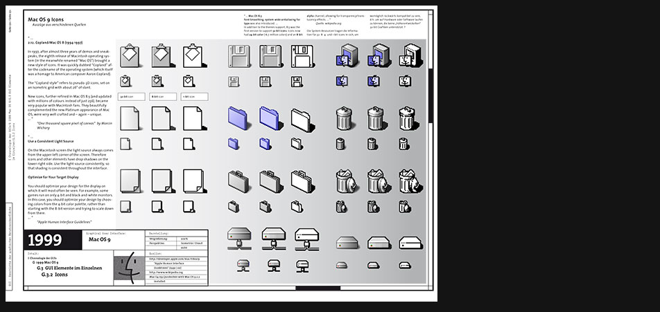
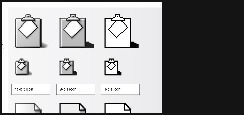
2.12. Copland/Mac OS 8 (1994-1997)
In 1997, after almost three years of demos and sneak-peaks, the eighth release of Macintosh operating system (in the meanwhile renamed Mac OS) brought a new style of icons. It was quickly dubbed Copland after the codename of the operating system (which itself was a homage to American composer Aaron Copland).
The Copland style refers to pseudo-3D icons, set on an isometric grid with about 26° of slant.
New icons, further refined in Mac OS 8.5 (and updated with millions of colours instead of just 256), became very popular with Macintosh fans. They beautifully complemented the new Platinum appearance of Mac OS, were very well crafted and again unique. ..."
"One thousand square pixel of canvas" by Marcin Wichary
"...
Use a Consistent Light Source
On the Macintosh screen the light source always comes from the upper-left corner of the screen. Therefore icons and other elements have drop shadows on the lower-right side. Use the light source consistently, so that shading is consistent throughout the interface.
Optimize for Your Target Display
You should optimize your design for the display on which it will most often be seen. For example, some games run on only 4-bit and black-and-white monitors. In this case, you should optimize your design by choosing colors from the 4-bit color palette, rather than starting with the 8-bit version and trying to scale down from there. ..."
"Apple Human Interface Guidelines" -
Mac OS 9 Icons
Page 4 zoomed in
-
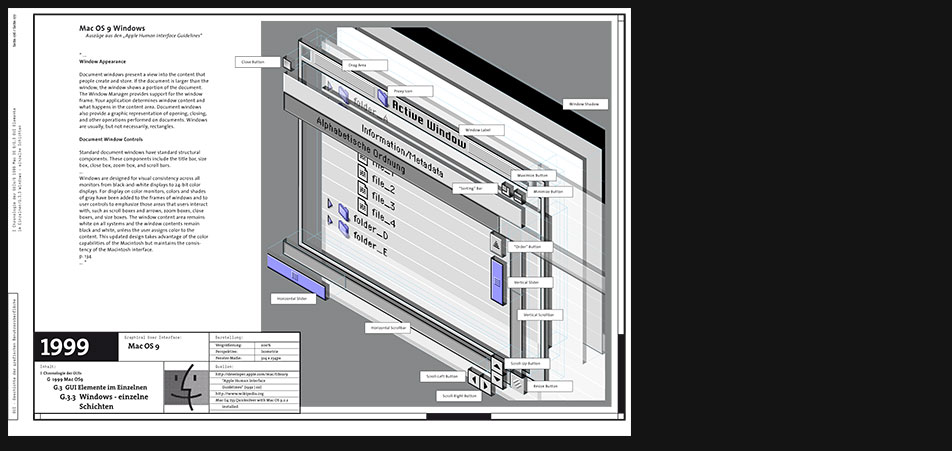
Mac OS 9 Windows
"...
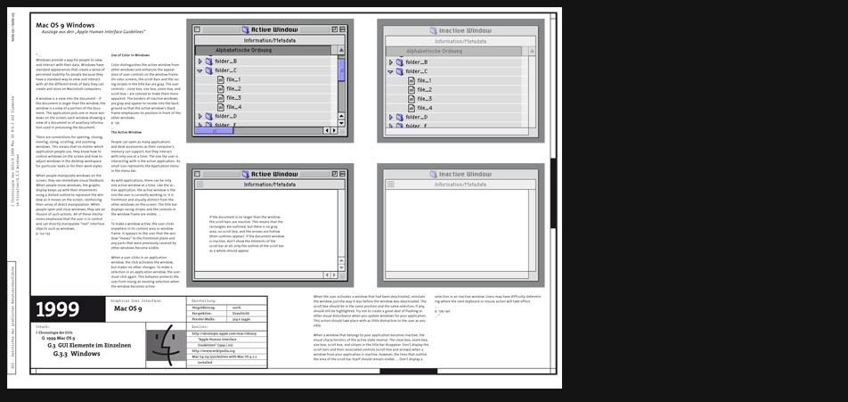
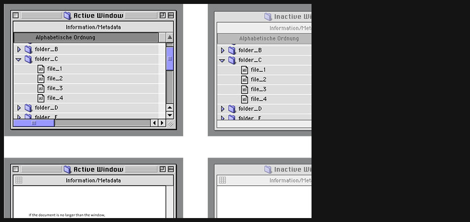
Use of Color in Windows
Color distinguishes the active window from other windows and enhances the appearance of user controls on the window frame. On color screens, the scroll bars and the racing stripes in the title bar are gray. The user controls close box, size box, zoom box, and scroll box are colored to make them more apparent. The borders of inactive windows are gray and appear to recede into the background so that the active windows black frame emphasizes its position in front of the other windows.
p. 135
...
The Active Window
People can open as many applications and desk accessories as their computers memory can support, but they interact with only one at a time. The one the user is interacting with is the active application. Its small icon represents the Application menu in the menu bar.
As with applications, there can be only one active window at a time. Like the active application, the active window is the one the user is currently working in. It is frontmost and visually distinct from the other windows on the screen. The title bar displays racing stripes and the controls in the window frame are visible. ...
...
To make a window active, the user clicks anywhere in its content area or window frame. It appears to the user that the window moves to the frontmost plane and any parts that were previously covered by other windows become visible...."
"Apple Human Interface Guidelines" -
Mac OS 9 Windows
Page 6 zoomed in
-
Mac OS 9 Windows
The "Apple Human Interface Guidelines" explain very thoroughly almost every aspect of the GUI and can be warmly recommended as an elementary reference book for learning about modern GUIs.
-
Mac OS 9 Windows
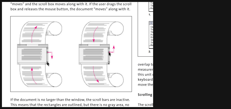
In this zoomed view of page 8 you can see e.g. how well metaphors, in this case the scroll metaphor, are being explained.
-
Mac OS 9 Windows
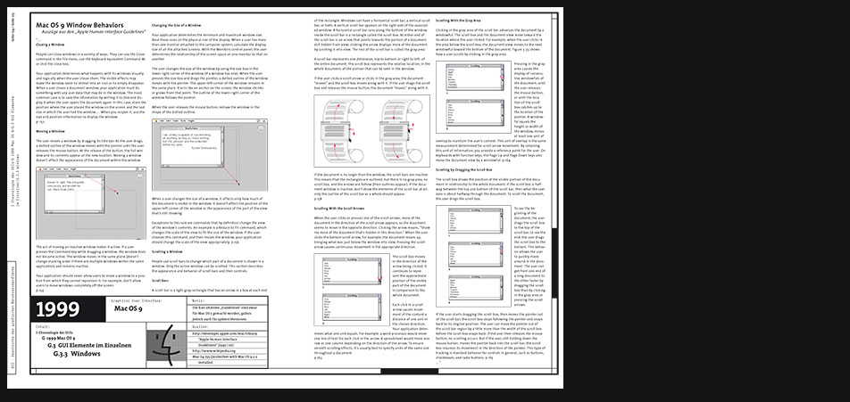
"...
Window Appearance
Document windows present a view into the content that people create and store. If the document is larger than the window, the window shows a portion of the document. The Window Manager provides support for the window frame. Your application determines window content and what happens in the content area. Document windows also provide a graphic representation of opening, closing, and other operations performed on documents. Windows are usually, but not necessarily, rectangles.
Document Window Controls
Standard document windows have standard structural components. These components include the title bar, size box, close box, zoom box, and scroll bars.
...
Windows are designed for visual consistency across all monitors from black-and-white displays to 24-bit color displays. For display on color monitors, colors and shades of gray have been added to the frames of windows and to user controls to emphasize those areas that users interact with, such as scroll boxes and arrows, zoom boxes, close boxes, and size boxes. The window content area remains white on all systems and the window contents remain black and white, unless the user assigns color to the content. This updated design takes advantage of the color capabilities of the Macintosh but maintains the consistency of the Macintosh interface.
p. 134
..."
"Apple Human Interface Guidelines" -
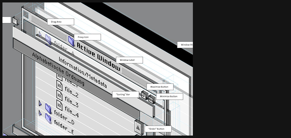
Mac OS 9 Windows
Layered view of the Mac OS 9 windows's planes and user controls
-
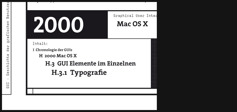
2000 Mac OS X
"...
Mac OS 9 was built on the foundation of the original Mac OS released in 1984. Mac OS X, however, is a new operating system that is built on the foundation of BSD Unix and incorporates some NeXT technology. This change was made to eliminate many technical limitations of older Mac OS and in the process much of the user interface was revamped as well. ..."
toastytech.com
"...
Aqua is the graphical user interface and primary visual theme of Apple Inc.s Mac OS X operating system. It is based around the theme of water, as its name suggests, with droplet-like elements and liberal use of translucency and reflection effects. Steve Jobs noted Aquas glossy aesthetic: One of the design goals was when you saw it you wanted to lick it.
The Aqua theme and user interface was first introduced at the January 2000 Macworld Conference & Expo in San Francisco. Aquas first appearance in a commercial product was in the July 2000 release of iMovie 2.
Aqua design elements make up the uniform appearance of most Mac OS X applications. Its goal is to incorporate color, depth, translucence, and complex textures into a visually appealing interface in Mac OS X applications.Although Aqua is the entire user interface, two notable features of Aqua are gel-like buttons (such as the ones colored red, yellow, and green that control the windows), and a Dock, which facilitates the launching of and navigation between applications.
Aqua is the successor to Platinum, which was used in Mac OS 8 and 9.
Much of Aquas original design was intended to complement the translucent two-tone look of Apples contemporaneous hardware, primarily the original bondi blue iMac. In 2003 and 2004, Apple moved to the use of brushed metal in their industrial design (such as with the aluminum Apple Cinema Displays); Aqua changed accordingly, incorporating the additional brushed metal look while deemphasizing the pinstripe backgrounds and transparency effects. ..."
en.wikipedia.org -
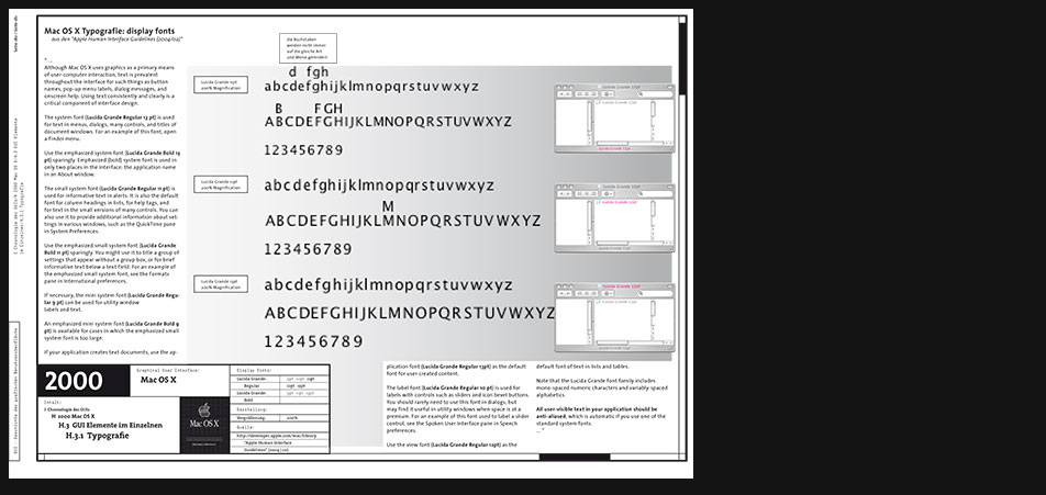
Mac OS X Typography
"...
Although Mac OS X uses graphics as a primary means of user-computer interaction, text is prevalent throughout the interface for such things as button names, pop-up menu labels, dialog messages, and onscreen help. Using text consistently and clearly is a critical component of interface design.
The system font (Lucida Grande Regular 13 pt) is used for text in menus, dialogs, many controls, and titles of document windows. For an example of this font, open a Finder menu.
Use the emphasized system font (Lucida Grande Bold 13 pt) sparingly. Emphasized (bold) system font is used in only two places in the interface: the application name in an About window.
The small system font (Lucida Grande Regular 11 pt) is used for informative text in alerts. It is also the default font for column headings in lists, for help tags, and for text in the small versions of many controls. You can also use it to provide additional information about settings in various windows, such as the QuickTime pane in System Preferences.
Use the emphasized small system font (Lucida Grande Bold 11 pt) sparingly. You might use it to title a group of settings that appear without a group box, or for brief informative text below a text field. For an example of the emphasized small system font, see the Formats pane in International preferences. ..."
from the "Apple Human Interface Guidelines (2004/02)" -
Mac OS X Typography
Page 2 zoomed in shows where the different fonts are being applied in the Mac OS X GUI.
-
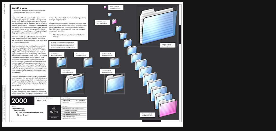
Mac OS X Icons
"...
Every previous Mac OS release had the icons drawn on a classic 32x32 pixel grid, with the only significant change being the increasing number of colours (from two in System 1 to over 16 millions in Mac OS 8.5 and 9). However, 2001s Mac OS X brought the completely new, anti-aliased, semi-transparent Aqua interface, and that warranted a change of icon style as well. The change turned out to be a complete overhaul, as practically all the properties of the new icons was different.
New icons were huge 128x128 pixel grid was sixteen times as spacious as the one in previous versions of Mac OS. The icons were presented in 24-bit depth with an 8-bit transparency mask.
Gone were the pixels. Not literally, of course, but all of the icons had photorealistic style instead of symbolic one. To quote Apple Human Interface Guidelines , Aqua offers a new photo-illustrative icon style it approaches the realism of photography, but uses the features of illustrations to convey a lot in a small space. Icons can be represented in 128x128 pixels to allow ample room for detail. Anti-aliasing makes curves and nonrectilinear lines possible. Alpha channels and translucency allow for complex shading and dimensionality. All of these qualities pave the way for lush imagery that enables you to create vibrant icons that communicate in ways never before possible. The new icons also heavily featured transparency/translucency and shadows.
Icons were scaled automatically by system to smaller and bigger sizes. This was probably the first instance of this feature done correctly, which means that user was usually unable to distinguish between a big icon scaled down to, for example, 16x16 and the icon with this native resolution.
Mac OS X got rid of Copland look in favour of three different perspectives: application icons sitting on a desk in front of user, utility icons standing on a shelf in front of user and the toolbar icons featuring a classic straight-on perspective.
Many Mac users critiqued the bold move. The icons were simply too big, too colourful, too funky, leaving nothing to the imagination. The hard disk icon simply became... hard disk, even if not many people know how such a device actually looks like. ..."
"One thousand square pixel of canvas" by Marcin Wichary -
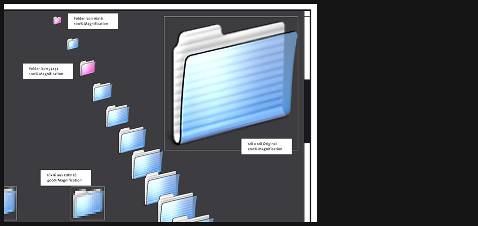
Mac OS X Icons
- Page 4 zoomed in
- My intention here is to show that with Mac OS X icons became almost continuous zoomable.
-

Mac OS X Icons
Scope and Design Guidelines
"...
Aqua offers a photo-illustrative icon style - it approaches the realism of photography but uses the features of illustrations to convey a lot in a small space. Icons can be represented in 128 x 128 pixels to allow ample room for detail. Anti-aliasing makes curves and nonrectilinear lines possible. Alpha channels and translucency allow for complex shading and dimensionality. All of these qualities pave the way for lush imagery that enables you to create vibrant icons.
...
Icon Perspectives and Materials
The angles and shadows used for depicting various kinds of icons are intended to reflect how the objects would appear in reality. All Aqua interface elements have a common light source from directly above, not from the upper-left corner as in Mac OS 9 and earlier. The various perspectives are achieved by changing the position of an imaginary camera capturing the icon.
Application icons look like they are sitting on a desk in front of you.
Utility icons are depicted as if they were on a shelf in front of you. Flat objects appear as if there were a wall behind them with an appropriate shadow behind the object. An actual three-dimensional object such as a rocket, however, would more realistically be viewed sitting on the ground; its icon shows the rocket sitting on a shelf, with its shadow below it.
For toolbar icons, the perspective is also straight-on, as if the object is on a shelf in front of you with the shadow below it.
Icons that represent actual objects should look as though they are made of real materials. Examine various objects to study the characteristics of plastic, glass, paper, and metal. Your icon will look more realistic if you successfully convey the items weight and feel, as well as its appearance. ..."
"Apple Human Interface Guidelines (2004/02)" -

Mac OS X Icons
Page 6 zoomed in
-

Mac OS X Windows
"...
Windows provide a frame for viewing and interacting with applications and data.
From a developers perspective, there are many types of windows in Mac OS X. Although a user might see them all as windows, the distinctions in behavior (layering, zooming, minimizing) and appearance (title bars) among the various types of windows contribute to the Macintosh user experience. It is important that you understand the different types of windows available, general window behavior, and behavior specific to one type of window. ..."
"Apple Human Interface Guidelines"
"...
Each window has Close, Minimize and Maximize button on it. The X, -, and + symbols only appear when the mouse moves over these buttons. This behavior is to help reduce the appearance of desktop clutter.
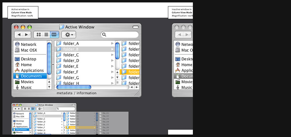
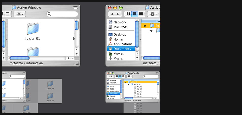
Finder windows can open in one of three different views. The standard icon view, a detailed list view, or column view. By default the new finder browses in a single window, but can optionally browse in multiple windows. A nice feature of this Finder is that unlike certain other modern desktop / file managers, it is not a web browser.
The column view is new to MacOS X and inherited from the NeXT user interface. In column view, starting at the computer level each subsequent folder is shown in a new column. The last column becomes a preview window if a previewable file is selected.
One of the big changes in the MacOS X user interface (code named Aqua) is the amount of eye candy used. Eye candy refers to gradients, background patterns, animation, and transparency that cause users to go oooohhhh and ahhhhh while providing no technical function. However the average user seems to like eye candy so including it helps boost sales. ..."
toastytech.com -
Mac OS X Windows
Page 8 zoomed in
-
Mac OS X Windows
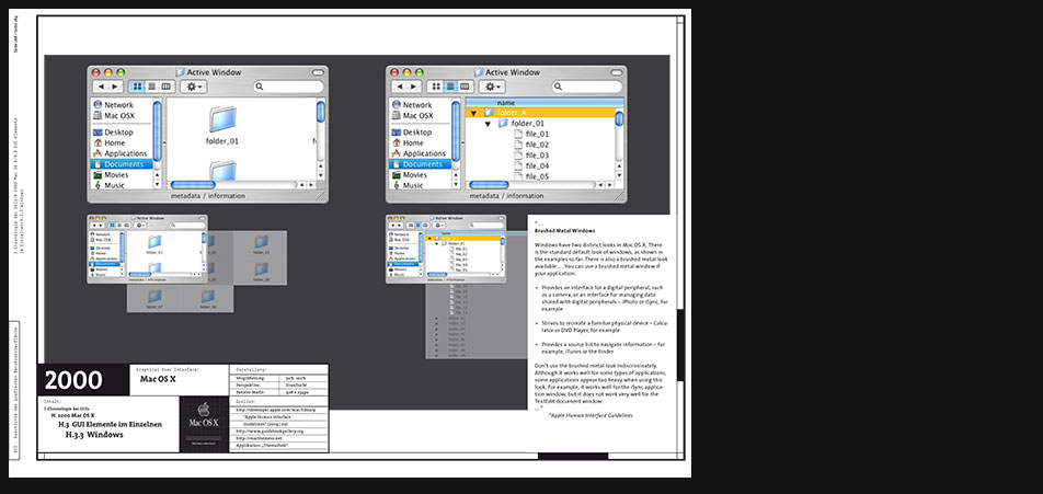
"...
Brushed Metal Windows
Windows have two distinct looks in Mac OS X. There is the standard default look of windows, as shown in the examples so far. There is also a brushed metal look available... . You can use a brushed metal window if your application:- Provides an interface for a digital peripheral, such as a camera, or an interface for managing data shared with digital peripherals iPhoto or iSync, for example
- Strives to recreate a familiar physical device Calculator or DVD Player, for example
- Provides a source list to navigate information for example, iTunes or the Finder
Dont use the brushed metal look indiscriminately. Although it works well for some types of applications, some applications appear too heavy when using this look. For example, it works well for the iSync application window, but it does not work very well for the TextEdit document window. ..."
"Apple Human Interface Guidelines (2004/02)" -
Mac OS X Windows
Page 10 zoomed in
-

Mac OS X Windows
"...
Every document, application, and utility window should have, at a minimum:- A title bar. Even if the window does not have an actual title (a tools palette, for example), it should have a title bar so that users can move the window.
- A close button, so that the user has a consistent way to dismiss it.
In addition, a standard document window has the following attributes that an application or utility window might not have:
- Scroll bars (if not all the windows contents are visible)
- Minimize and zoom buttons
- A proxy icon (after a document has been saved)
- The title of the document
- A resize control
- A toolbar control
..."
"Apple Human Interface Guidelines (2004/02)" -

Mac OS X Windows
Window layers and user controls in isometric view
-
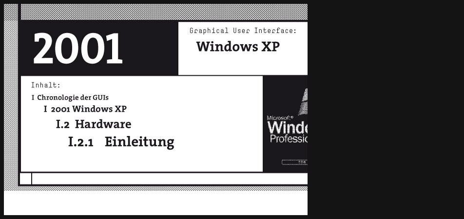
2001 Windows XP
"...
With Windows XP (XP allegedly stands for Experience) Microsoft has given The Windows UI yet another makeover.
The primary differences between Windows XP (AKA Windows NT 5.1) and Windows 2000 (Windows NT 5.0) are a shiny new blue theme and yet even more webbyness.
Windows XP marks the end of the DOS based Windows as there has been no updated version of the DOS based Windows released since Windows ME. Windows XP is now the only desktop OS produced by MS and comes in both "home" and "professional" flavors.
Microsoft requires users of Windows XP to "activate" their copy of Windows by phoning Microsoft. You have two options. You may activate over the Internet if you have access, or you may call a Microsoft customer service representative and give them this HUGE (50 character) installation ID number and they give you another really long one back that you must type in as a confirmation ID.
In the event your computer hardware changes (if you upgrade it or add a component) Windows XP may demand that you re-activate with Microsoft.
You had better hope you are somewhere near a phone when you install this monster. If you dont have internet access hope you are not dyslexic and are a good typist. You had better hope Linux or the DOJ hasnt put Microsoft out of business because with no one to activate this product for you, you will be up the creek.
I predict that 5 years or so from now Microsoft will refuse to activate Windows XP any more. The reason? There will be a newer version of Windows out by then that Microsoft will do anything to make you buy. Need to re-load that old computer that crashed? Forget it, expect to fork out more money for the latest Windows that probably will require you to buy a faster computer anyway. ..."
toastytech.com -
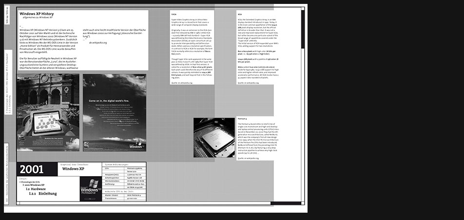
Windows XP Hardware H H H System Requirements CPU Pentium 233MHz, 300MHz better Hard Disk 1.5GB just for the OS Memory 64MB RAM, 128MB better Computer Graphics SVGA 800x600, XGA 1024x768 better best CPU at that time Brand: Intel Pentium 4 Transistor Amount: 42 000 000 Description Image content description
Computer graphics standards are being described, e.g. what SVGA or XGA mean. Other hardware specifications like the Pentium 4 cpu are introduced.
-
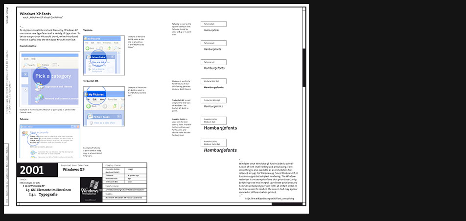
Windows XP Typography
"...
To improve visual interest and hierarchy, Windows XP uses some new typefaces and a variety of type sizes. To better support our Microsoft brand, weve introduced Franklin Gothic into the Windows XP user interface. ..."
from "Windows XP Visual Guidelines" -
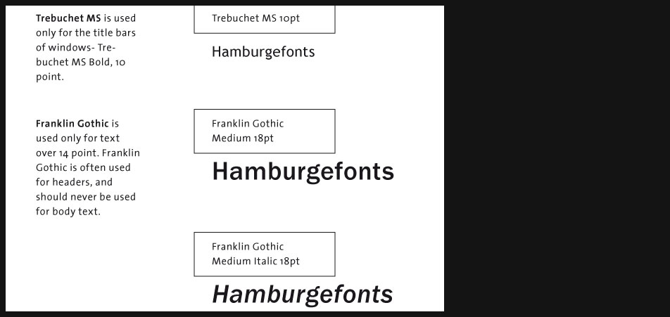
Windows XP Typography
Page 3 zoomed in
-
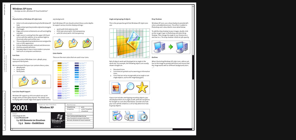
Windows XP Icons
"...
Characteristics of Windows XP-style Icons- Color is rich and complementary to the Windows XP look.
- Angle and perspective provides a dynamic energy to the images.
- Edges and corners of elements are soft and slightly rounded.
- Light source is coming from the upper left-hand corner with the addition of an ambient light to illuminate other parts of the icon.
- The use of gradients provide dimension and give the icon a richer appearance.
- A drop shadow provides contrast and dimension.
- Outlines provide definition.
- Everyday objects have a more modern consumer look such as computers and devices.
-
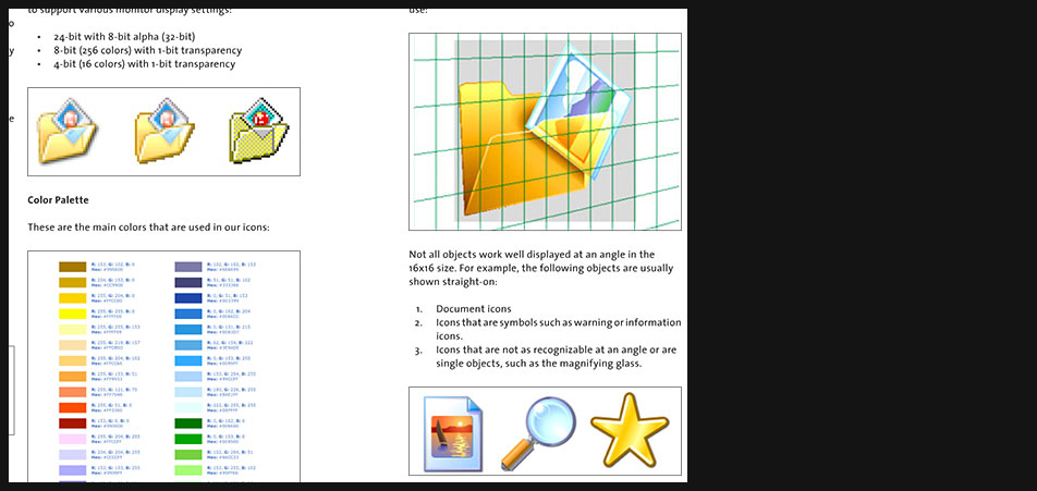
Windows XP Icons
"
Angle and grouping of objects
This is the perspective grid that Windows XP-style icons use:
...- Document icons
- Icons that are symbols such as warning or information icons
- Icons that are not as recognizable at an angle or are single objects, such as the magnifying glass
-
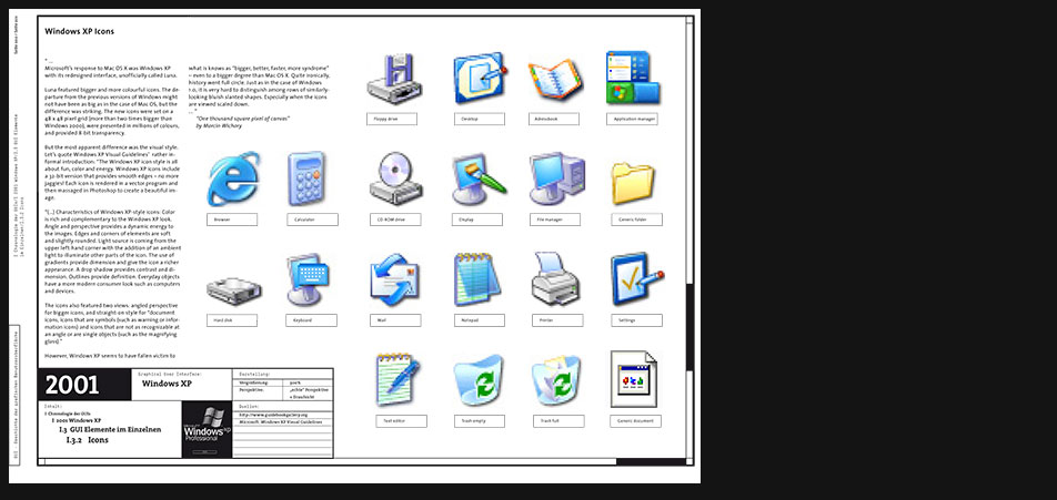
Windows XP Icons
"...
Microsofts response to Mac OS X was Windows XP with its redesigned interface, unofficially called Luna.
Luna featured bigger and more colourful icons. The departure from the previous versions of Windows might not have been as big as in the case of Mac OS, but the difference was striking. The new icons were set on a 48 x 48 pixel grid (more than two times bigger than Windows 2000), were presented in millions of colours, and provided 8-bit transparency.
But the most apparent difference was the visual style. Lets quote Windows XP Visual Guidelines rather informal introduction: The Windows XP icon style is all about fun, color and energy. Windows XP icons include a 32-bit version that provides smooth edges no more jaggies! Each icon is rendered in a vector program and then massaged in Photoshop to create a beautiful image.
(...) Characteristics of Windows XP-style icons: Color is rich and complementary to the Windows XP look. Angle and perspective provides a dynamic energy to the images. Edges and corners of elements are soft and slightly rounded. Light source is coming from the upper left-hand corner with the addition of an ambient light to illuminate other parts of the icon. The use of gradients provide dimension and give the icon a richer appearance. A drop shadow provides contrast and dimension. Outlines provide definition. Everyday objects have a more modern consumer look such as computers and devices.
The icons also featured two views: angled perspective for bigger icons, and straight-on style for document icons, icons that are symbols (such as warning or information icons) and icons that are not as recognizable at an angle or are single objects (such as the magnifying glass).
However, Windows XP seems to have fallen victim to what is knows as bigger, better, faster, more syndrome even to a bigger degree than Mac OS X. Quite ironically, history went full circle. Just as in the case of Windows 1.0, it is very hard to distinguish among rows of similarly-looking bluish slanted shapes. Especially when the icons are viewed scaled down. ..."
"One thousand square pixel of canvas" by Marcin Wichary -
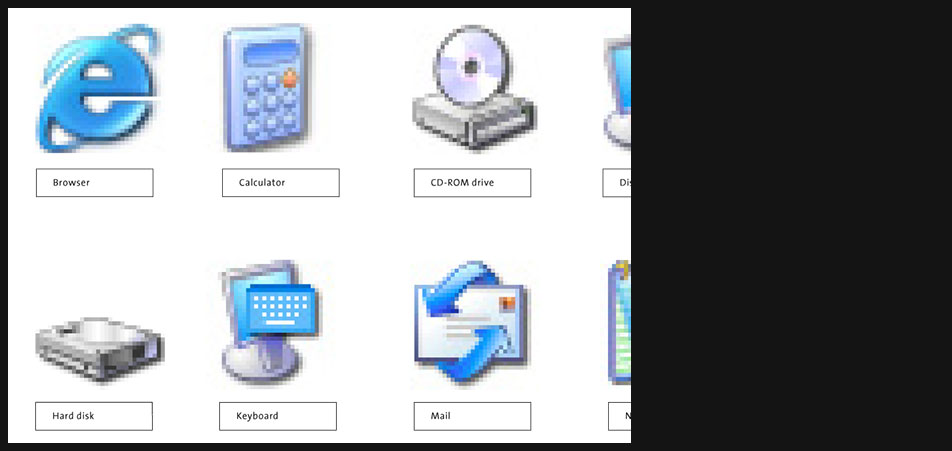
Windows XP Icons
Page 7 zoomed in
-
Windows XP Windows
"...
Probably the most popular feature in Windows XP is its new ability to theme the window management and controls.
The default Windows XP theme (Which has been called the Bozo the clown theme by a number of people) replaces the previously industry standard 3-d appearance with a flat appearance that is geared more towards web pages.
Unfortunately the only themes that are included are the Windows XP and Classic (no theme) theme. Because these are drawn using graphics they do not respect system colors and must use variations of the theme instead.
The Windows XP theme includes only blue, olive green, and silver color variations. You like red? Forget it. You could turn off the themes and use the system colors (now under the advanced button shown above), but the pretty theme was probably what you bought Windows XP for wasnt it?
Well, the themeing ability makes it easier for MS to change things around in the future so consumers will go ohhh and ahhh at the same old thing thinking it is something different. ..."
toastytech.com -
Windows XP Windows
"...
Windows Status Bar
The status bar is located at the bottom of a window and displays information about the current state of the document or other information in the window.
The status bar is composed of 3 different pieces: the background area, separators to group information and grippers for resizing the window.
Window Title Bar and Frame
The window title bar and frame are the outer most elements of a window. There are two sets of frames and title bars: standard windows and tool palettes.
Toolbars
The Windows XP toolbar displays 2 icon sizes: 24x24 and 16x16 pixels. There are 2 icon states: default and hot. By default, the icons are in color and on mouse-over they appear slightly more saturated. ..."
from "Windows XP Visual Guidelines"
-
Plakat - Skizzen und Ideen
Obwohl sich die ganze Thematik auf einem digitalen Medium abspielt, ist es wichtig dieses mit dem Printmedium zu unterstützen. Ein Plakat z.B. bietet Bilder und Schrift nicht nur in einer höheren Auflösung an, die eventuell kleinere Schriftschnitte erlaubt, sondern es kann viel größere Formate füllen als die grössten M0nitore - kann also viel mehr auf einen Blick aufbereiten -, es kann gefaltet werden und ist natürlich sehr schlank. Das Printmedium hat aber auch seine artspezifischen Schwächen. Es kann vermeintlich nur statische Sachverhalte darstellen. Es bietet sich also an, beide Medien zu kombinieren, um überall dort, wo das Plakat überfordert wird, auf eine eventuelle Ergänzung in einem digitalen Teil zu verweisen.
-
Plakat - Skizzen und Ideen
Metafern der grafischen Benutzeroberflächen
Eine der ersten Aufgaben war es zu ermitteln, welche Metafern der realen Welt sich bewährt haben und praktisch unverändert seit ihren Anfängen von den meisten Benutzeroberflächen heute noch verwendet werden.
Die wichtigsten Metafern sind:- die Fenster-Metafer mit der dazugehörigen Dokument-Scroll-Metafer, bei der nur ein Ausschnitt des Dokuments gezeigt wird und man sich mit Hilfe der Scroll-Elemente den restlichen Bereich anzeigen lassen kann.
- die Desktop-Metafer samt der Dokumente und Ordner die auf dem Desktop verteil herumzuliegen pflegen
- die sogenannten UserControls, die solchen Apparaten der realen Welt, wie dem Radio entnommen sind
-
Plakat - Skizzen und Ideen
Plakat - Auswahl der Themen
Da das Plakat als ein geeignetes Medium für die Aufzeichnung einer Chronologie der Entstehung von grafischen Benutzeroberflächen erschien, galt es herauszusortieren, welche Eigenschaften der GUIs auf dem Plakat ihren Platz finden könnten.
Da es sich beim Plakat um ein statisches Medium handelt, kamen also eigentlich nur grafische Merkmale in Frage, die dynamischen Aspekte müssten auf anderem Wege erklärt werden. -
Plakat - Skizzen und Ideen
Parametrisierte Matrizen
Zunächst war eine autarge Anwendung gedacht, die zwar ergänzend zum Plakat stattfinden, jedoch nicht mit dem Plakat kommunizieren würde.
Solche Matrizen würden einzelne Merkmale innerhalb einer Chronologie vergleichbar und auswählbar machen. Wenn man z.B. Icons der verschiedenen GUIs miteinander vergleichen will, ist die X-Achse mit dem chronologischen Parameter belegt und die Y-Achse nach unten hin mit dem Parameter Art, also der Art des Icons (Folder, Document, Trash etc.). Diese Aufbereitung macht die Elemente auf Anhieb vergleichbar.
Auswahl der Merkmale, die untersucht oder verglichen werden wollen
Parametrisierte Matrizen scheinen jedoch den Nachteil zu haben, dass sie nur oberflächlich, im Fall von GUIs also nur die Grafiken, den Look, vergleichen können. Zumindest ist es so, dass man mit Hilfe der Matrix Elemente auswählen könnte, man müsste dann aber woanders hin um diese Elemente entweder genauer auf ihr Verhalten untersuchen oder vergleichen zu können. -
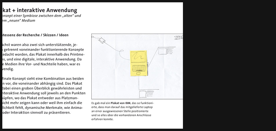
Plakat + interaktive Anwendung
Quintessenz der Recherche / Skizzen / Ideen
Zunächst waren also zwei sich unterstützende, jedoch getrennt voneinander funktionierende Konzepte ausgedacht worden, das Plakat innerhalb des Printmediums, und eine digitale, interaktive Anwendung. Da beide Medien ihre Vor- und Nachteile haben, war es notwendig.
Das finale Konzept sieht eine Kombination aus beiden Teilen vor, die voneinander abhängig sind. Das Plakat soll dabei einen groben Überblick gewährleisten und die interaktive Anwendung soll jeweils an den Punkten anknüpfen, wo das Plakat entweder aus Platzmangel nicht mehr zeigen kann oder weil ihm einfach die Möglichkeit fehlt, dynamische Merkmale, wie Animation oder Interaktion sinnvoll zu präsentieren.
Es gab mal ein Plakat von IBM, das so funktionierte, dass man darauf das mitgelieferte Laptop an einer ausgewiesenen Stelle positionierte und so alles über die vorhandenen Anschlüsse erfahren konnte. -
Plakat + interaktive Anwendung
Skizzenhafte Visualisierung des Zusammenspiels zwischen Plakat und interaktiver Anwendung
-
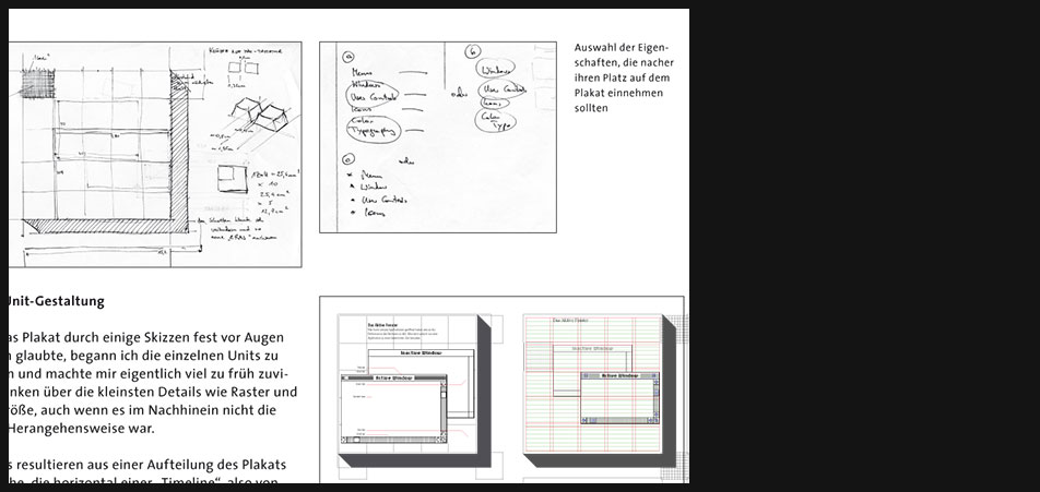
Plakatgestaltung
Plakat: Unit-Gestaltung
Da ich das Plakat durch einige Skizzen fest vor Augen zu haben glaubte, begann ich die einzelnen Units zu gestalten und machte mir eigentlich viel zu früh zuviele Gedanken über die kleinsten Details wie Raster und Schriftgröße, auch wenn es im Nachhinein nicht die richtige Herangehensweise war.
Die Units resultieren aus einer Aufteilung des Plakats in Bereiche, die horizontal einer Timeline, also von 1981 (Xerox Star 8010) bis 2001 (Windows XP), und vertikal thematisch den ausgewählten Bereichen: Menu, Windows, Controls und Icons, folgen.
Da diese Units nacher mit der interaktiven Anwendung kommunizieren sollten, haben sie das abstrahierte Aussehen einer Keyboard-Taste, was signalisieren soll, dass man über das Drücken einer der Tasten der Rechner-Tastatur, zu der Stelle in der digitalen Anwendung gelangt, wo mehr Input zur ausgewählten Eigenschaft geliefert wird.
Dieser Von-hinten-durch-die-Brust-mitten-ins-Auge-Versuch ging jedoch wirklich ins Auge, da sich die Units schnell als zu gross herausstellten, um auf einer DIN-Plakatgröße Platz zu finden. -
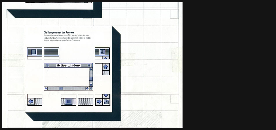
Plakatgestaltung
Einzelne Units in einem ungefähren Plakatraster angeordnet
-
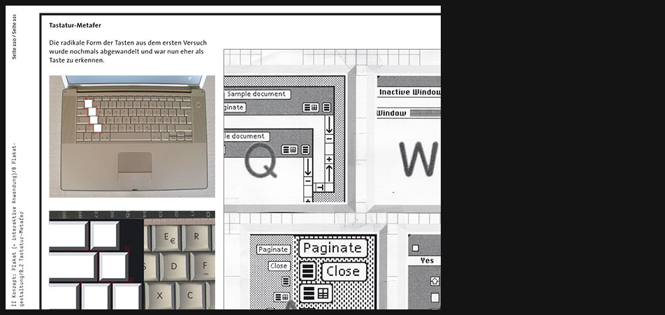
Plakatgestaltung
Tastatur-Metafer
Die radikale Form der Tasten aus dem ersten Versuch wurde nochmals abgewandelt und war nun eher als Taste zu erkennen.
Als Vorlage für die Tasten dient die Tastatur eines Appl-Laptops. -
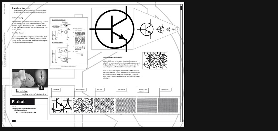
Plakatgestaltung
Transistor-Metafer
Ein Versuch die Performance eines Computers über die Miniaturisierung der Transistoren auszudrücken.
Miniaturisierung
Die Anzahl der Transistoren auf einer CPU stieg z.B. von 29 000 auf der Intel 8088 CPU im Jahr 1980 oder 190 000 auf der Motorola 68 010 CPU 1984, auf ca. 42 000 000 Transistoren auf der Intel Pentium 4 CPU im Jahr 2000.
Transistor abstrakt
In der technischen Zeichnung wird der Transistor recht einfach dargestellt. Diese Zeichnung dient nacher als Piktogram, um auf dem Plakat die Miniaturisierung der CPU Strukturen zu verdeutlichen. -
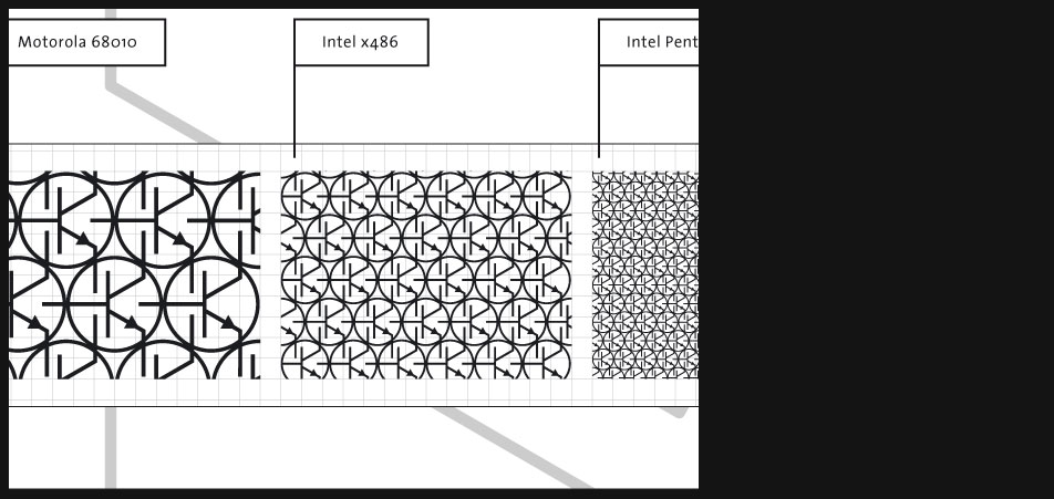
Plakatgestaltung
Proportionale Transformation
Bei der Größendarstellung der einzelnen Transistoren habe ich versucht echte Proportionen zu bewahren, damit der Betrachter besser nachvollziehen kann, wie sehr die Technologie im Laufe der Zeit miniaturisiert wurde.
Oben ist die Skalierung von einem Intel 8088 Transistor (links) hin zu einem Bauteil der Pentium 4 CPU (rechts) zu sehen. Der Transistor der ersten modernen CPU (Intel 8080, graues Hintergrundbild) passt hier leider nicht ganz aufs Blatt. -
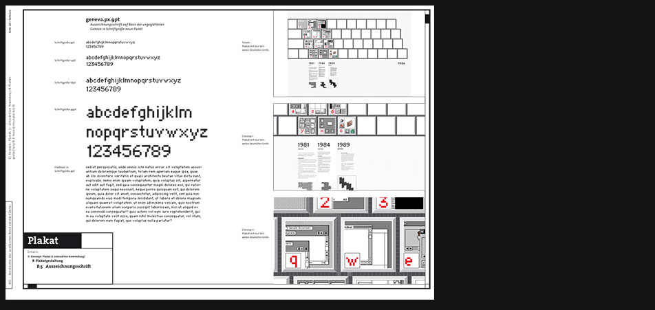
Plakatgestaltung - Typografie
Auszeichnungsschrift
Die Auszeichnungsschrift basiert auf der ungeglätteten Geneva in SchriftgrÖße neun Punkt und soll auf dem Plakat als "Eyecatcher" für die Auszeichnung der jeweiligen Bereiche stehen. -
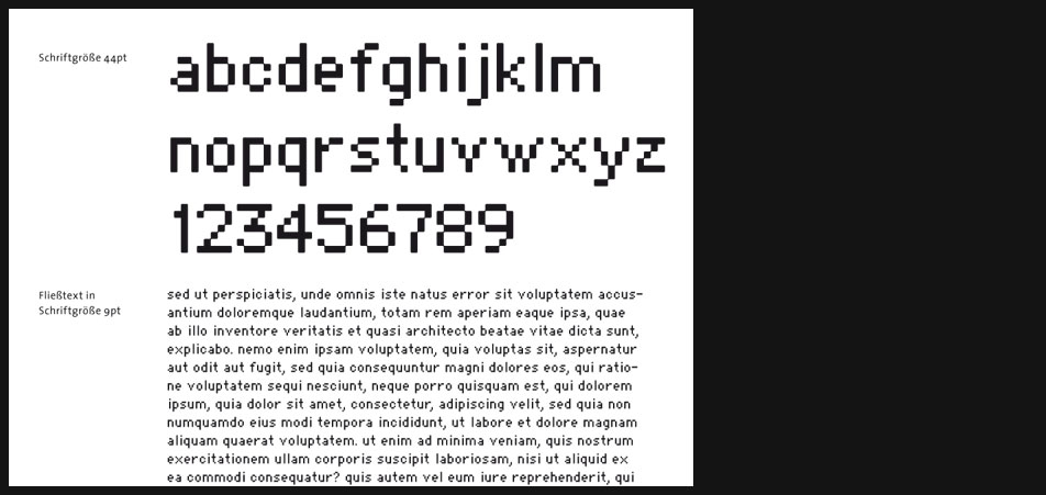
Plakatgestaltung - Typografie
Die Schrift funktioniert bei jeder Schriftgröße gleich, d.h. sie bewahrt stets den Pixelcharakter um so die digitale Metafer zu verdeutlichen.
-
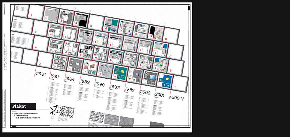
Plakat
Auf dem Plakat sind die "Tasten" schräg angeordnet, weil später ein Laptop an der dafür auf dem Plakat ausgewiesenen Stelle seinen Platz finden soll, und so beide miteinander ergonomisch harmonisieren können bzw. sollen.
-
Plakat - Interaktive Anwendung
Digitale Plakaterweiterung
Nachdem der Betrachter sich auf dem Plakat eine grafische Benutzeroberfläche ausgesucht hat, die ihn interessiert, kann er nun innerhalb einer interaktiven Anwendung, die als Erweiterung des Plakats dient, sein Wissen zu einem bestimmten Bereich (Menü, Fenster, Controls, Icons) vertiefen. Im Gegensatz zum gedruckten Plakat, kennt die digitale Erweiterung keine räumlichen Einschränkungen.
Navigation
Man muss sich die interaktive Anwendung wie ein riesiges Plakat vorstellen, das - die Fenster-Metafer machts möglich - in der XY-Ebene hin- und hergeschoben wird, aber auch an jeder Stelle das Blättern in die Tiefe bzw. Z-Achsenrichtung erlaubt, falls Inhalte dafür bereitstünden.
Wichtig ist, dass dabei das Plakat mit der interaktiven Anw. ständig in Kontakt bleibt, d.h. dass beide Medien ein gemeinsames Erkennungszeichen haben, das Auskunft bzw. Feedback darüber gibt, wo man sich gerade befindet. Dies geschieht über ein rotes Zeiche, in der digitalen Anw. kommt noch ein erweitertes Stapel-Symbol hinzu, das die momentane Position in der Tiefe anzeigt. -
Plakat - Interaktive Anwendung
Diese Visualisierung soll verdeutlichen, dass im sogenannten Viewport der Anwendung immer nur ein "Unit" des Plakats sichtbar ist und man über das Drücken der entsprecheneden Tasten zu den jeweiligen Bereichen des Plakats navigieren kann.
-
Plakat - Abfotografiert
...zusammengefaltet
-
Plakat - Abfotografiert
...teilweise auseinandergefaltet
-
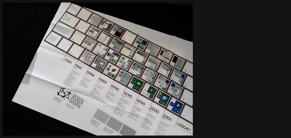
Plakat - Abfotografiert
...ganz auseinandergefaltet. Links am Plakat erkennt man eine angeschnittene graue Fläche, wo das Laptop samt der interaktiven Anwendung positioniert werden soll.
-
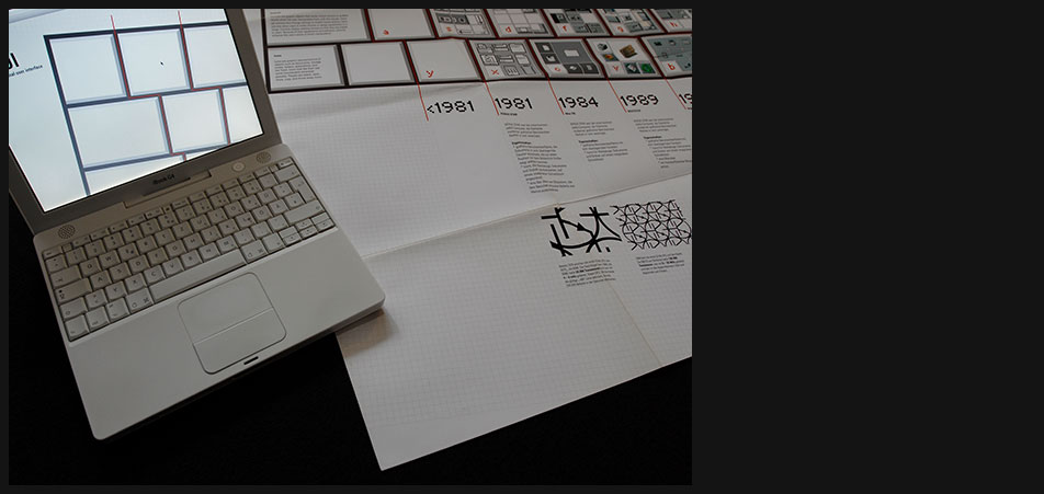
Plakat - Abfotografiert
Laptop wird positioniert und die digitale Anwendung gestartet.
-
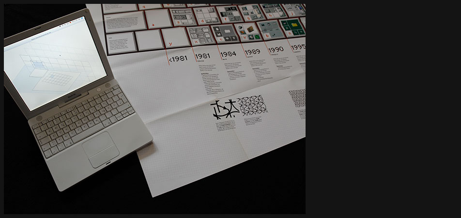
Plakat - Abfotografiert
-
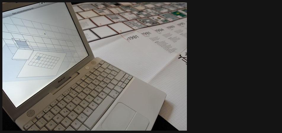
Plakat - Abfotografiert
-
Plakat - Abfotografiert
-
Plakat - Abfotografiert
-
ButtonLabor - Reale Schaltflächen
"Das ButtonLabor"
Die Desktopmetafer und ihre kleine Schwester, die Fenstermetafer, haben sich von Anfang an als gut funktionierende Methoden für die Mensch-Computer-Interaktion bewährt und es ist trotz vieler Versuche, das Rad neu zu erfinden, nicht absehbar und für mich kaum vorstellbar, dass man dieses Prinzip eines Tages verwerfen bzw. zugunsten einer effektiveren Methode wird aufgeben müssen.
Da diese Metafern den Ursprung in einem dreidimensionalen Raum haben, wollte ich in diesem Teil des Projekts die Herkunft dieser räumlichen Aspekte erörtern. Es gilt jedoch nicht nur die visuellen Eigenschaften, wie Form, Farbe und Lichtführung etc. zu untersuchen, sondern auch das Verhalten in einem solchen Raum unter Beachtung verschiedener Parameter, wie z.B. der Zeit, Bewegung etc. -
ButtonLabor - Reale Schaltflächen
Ich bin durch das Hochschulgebäude gezogen und hab alle möglichen Schaltflächen und Knöpfe untersucht. Die Analyse wurde leider nur in einer mäßigen filmischen Qualität dokumentiert.
-
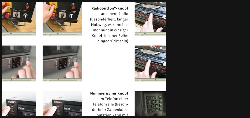
ButtonLabor - Reale Schaltflächen
Es gibt tatsächlich sehr viele verschiedene Knöpfe in realen Schnittstellen, wie Radios, Videorecorder, Werkstattmaschinen, Telekommunikationsger¨ten etc., die nicht nur völlig unterschiedlich aussehen, sondern auch sehr unterschiedlich "reagieren".
-
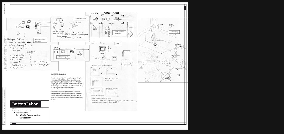
ButtonLabor - Skizzen und Ideen
Die Vielfalt der Knöpfe
Bereits während der Untersuchung der Knöpfe - Interface Schaltflächen bzw. User Controls ist aufgefallen, dass es sehr viele verschiedene Knöpfe gibt. Da wären z.B. die Runden oder die Rechteckigen, die Weichen oder die Harten, Knöpfe mit langem oder kurzem Hub etc.
Um möglichst viele Eigenschaften nacher in einem Interface erfahrbar machen zu könnnen, musste also zunächst erörtert werden, welche Unterscheidungskriterien, d.h. welche Parameter es gibt. -

ButtonLabor - Skizzen und Ideen
Ausgewählte Parameter
Folgende Unterscheidungskriterien sind meiner Meinung sinnvoll, um in einer interaktiven Anwendung eingesetzt zu werden:
Form + Größe sind auflösungsabhängig und entscheidend, wenn es darum geht, die Schaltfläche schnell als eine mit einer spezifischen Funktion belegte zu identifizieren und sie schnell und präzise anzuvisieren (ist der Knopf zu klein, kann es eventuell zu lange dauern, um ihn anzuklicken, siehe Hicks Law und Fitts Law). Das Material, aus dem der Knopf gemacht ist, spielt zwar in der realen Welt eine größere Bedeutung, ist aber dennoch ein interessanter Aspekt in der Untersuchung seiner Zweckmäßigkeit für eine virtuelle Schnittstelle.
Das Licht und die Richtung, aus der es kommt spielt eine wichtige Rolle für die Metafer. In der interaktiven Anwendung soll der Benutzer für diesen unscheinbaren Aspekt sensibilisiert werden.
Schliesslich gibt es noch die Komponente, die als größte Herausforderung gesehen werden kann, Verhalten + Zeit. Nicht nur, dass unterschiedlich Methoden ausprobiert werden könnten, um das Funktionieren einer Schaltfläche zu unterstützen, wie Magnetismus (nähert sich der Cursor einem aktiven Bereich der Schnittstelle an, wird er von ihr angezogen), ähnlich angewendet das Glühen etc. Statische Parameter wie Form und Größe können mit dieser Komponente kombiniert werden - nähert sich der Cursor der Schaltfläche, verändert der Knopf seine Form, Farbe, Kontrast etc.
Interessant ist nun die Frage, wie man diese Parameter, die unterschiedlich stark in die Tiefe gehen können, in de geplanten Interface am besten aufbereiten kann. Ausserdem ist es mir wichtig zu betonen, dass die Anzahl und die Kombinierbarkeit der Merkmale abhängig ist von der Auflösung, da eine höhere Resolution z.B. dem Aspekt Form viel mehr Freiraum gibt. -

ButtonLabor - Skizzen und Ideen
-
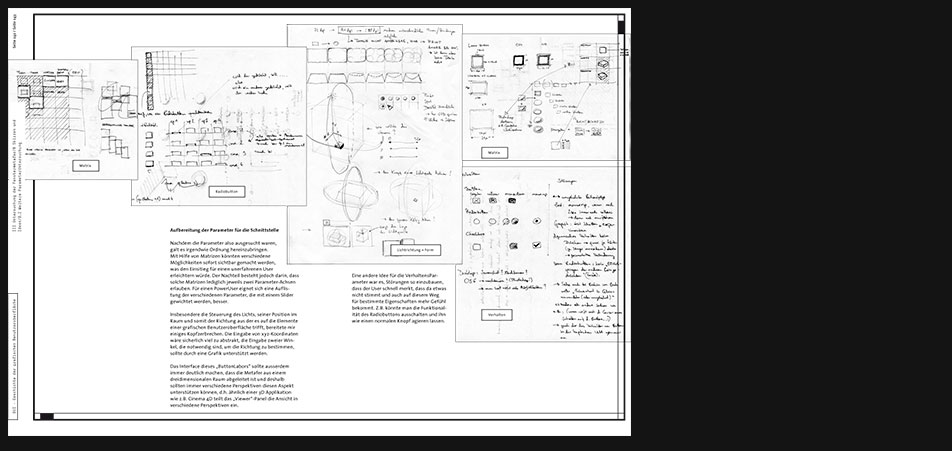
ButtonLabor - Skizzen und Ideen
Aufbereitung der Parameter für die Schnittstelle
Nachdem die Parameter also ausgesucht waren, galt es irgendwie Ordnung hereinzubringen. Mit Hilfe von Matrizen könnten verschiedene Möglichkeiten sofort sichtbar gemacht werden, was den Einsitieg für einen unerfahrenen User erleichtern würde. Der Nachteil besteht jedoch darin, dass solche Matrizen lediglich jeweils zwei Parameter-Achsen erlauben. Für einen PowerUser eignet sich eine Auflistung der verschiedenen Parameter, die mit einem Slider gewichtet werden, besser.
Insbesondere die Steuerung des Lichts, seiner Position im Raum und somit der Richtung aus der es auf die Elemente einer grafischen Benutzeroberfläche trifft, bereitete mir einiges Kopfzerbrechen. Die Eingabe von xyz-Koordinaten wäre sicherlich viel zu abstrakt, die Eingabe zweier Winkel, die notwendig sind, um die Richtung zu bestimmen, sollte durch eine Grafik unterstützt werden.
Das Interface dieses ButtonLabors sollte ausserdem immer deutlich machen, dass die Metafer aus einem dreidimensionalen Raum abgeleitet ist und deshalb sollten immer verschiedene Perspektiven diesen Aspekt unterstützen können, d.h. ähnlich einer 3D Applikation wie z.B. Cinema 4D teilt das Viewer-Panel die Ansicht in verschiedene Perspektiven ein. Eine andere Idee für die VerhaltensParameter war es, Störungen so einzubauen, dass der User schnell merkt, dass da etwas nicht stimmt und auch auf diesem Weg für bestimmte Eigenschaften mehr Gefühl bekommt. Z.B. könnte man die Funktionalität des Radiobuttons ausschalten und ihn wie einen normalen Knopf agieren lassen. -

ButtonLabor - Skizzen und Ideen
Das ButtonLabor
Aus den Skizzen hat sich herauskristalisiert, dass der Aufbau der Schnittstelle ähnlich einer 3D Applikation sein sollte, d.h. auf der linken Seite hat man ein viergeteiltes Fenster, das unterschiedliche Perspektiven, Vergrösserungen oder vielleicht auch Parameter, die es räumlich zu editieren gilt, zeigt. Die rechte Seite, man könnte sie ToolBar nennen, trägt die LaborInstrumente, mit deren Hilfe verschiedene Knöpfe mir verschiedenen Verhaltensweisen kreiert werden können. -

ButtonLabor - Prototyp
In Director habe ich eine kleine Anwendung gebaut, wo das Verhalten realer Schaltflächen simuliert wird. Ähnlich einem "Power"-Knopf am Monitor z.B. muss der User eine gewisse Zeit die Maustaste gedrückt halten, damit die Schalfläche arretiert werden kann. Wird diese zeitliche Schwelle nicht überschritten, kommt es auch zu keiner "Aktivierung".
Ausserdem erlaubt der Prototyp die Auswahl verschiedener Formen (rund, rechteckig, mit oder ohne Fasen) und Schatten (hart oder weich). -

ButtonLabor - Prototyp
Weiche, plastische, elastische Schaltflaechen
Interessant wird es, wenn man weiche Knöpfe simuliert, die sich z.B. in der echten Welt überall dort befinden, wo das Staub- bzw. Wasseindringen verhindert werden soll. Die Knöpfe haben dann wahrscheinlich eine ähnliche Konstruktion wie normale Knöpfe, sind jedoch samt ihrer umgebenden Struktur mit elastischen, gummiähnlichen Materialien überzogen. Aber auch die Knöpfe einer Fernbedienung sind oft aus weichem Material.
Jedenfalls ergeben sich hier viele spannende Möglichkeiten, die man auch weit über das hinaus durchspielen könnte, was in der realen Welt möglich bzw. dort Sinn machen würde. Man stelle sich z.B. Knöpfe aus Götterspeise vor, die eine gewisse Zeit lang nach dem Drücken schwingen bzw. zittern und so nachhaltig ein Feedback aussenden, dass sie aktiviert bzw. betätigt wurden. -
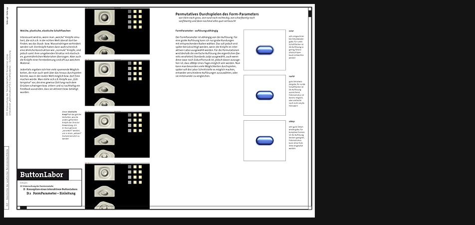
ButtonLabor - Konkretisierung
FormParameter - auflösungsabhängig
Der FormParameter ist abhängig von der Auflösung. Für eine grobe Auflösung kann ich nur grobe Rundungen mit entsprechenden Radien wählen. Das soll jedoch erst später berücksichtigt werden, wenn die Knöpfe im interaktiven Labor ausgewählt werden. Für die Permutationen wird deshalb die vierfache Auflösung des eigentlichen (bereits veralteten) Standards 72dpi ausgewählt, auch wenn diese zwar noch Zukunftsmusik ist, jedoch davon auszugehen ist, dass 288dpi eines Tages möglich sein werden. Nun kann man besonders viele Möglichkeiten durchspielen, später soll die Labor Schnittstelle es möglich machen, entweder verschiedene Auflösungen auszuwählen, oder sie miteinander zu vergleichen. -

ButtonLabor - FormParameter
Permutatives Durchspielen verschiedener Möglichkeiten in der Gestaltung einer Schaltfläche - Fasen, Radien, Abstände, Rahmen
In einer späteren, interaktiven Anwendung, dem sogenannten ButtonLabor, soll der User den Parameter Form frei einstellen dürfen, und sich so für diesen Aspekt der Schaltfläche sensibilisieren. Nach der groben Auswahl einer Grundform, dürfen viele Unterparameter ausgewählt werden, die dann bestimmen, ob der Knopf abgerundete oder scharfe Kanten hat und wie gross die Spaltmaße sind, die ihn vom Rest trennen etc. -

ButtonLabor - LichtParameter
Visualisierung der Lichtposition und -richtung im Raum
Für mich stand gleich zu Beginn fest, dass die blosse Eingabe abstrakter Winkelzahlen, um die Lichtrichtung zu bestimmen, aus der das Licht auf die Elemente der grafischen Bneutzeroberfläche trifft, nicht ausreichen würde, um die Problematik zu beschreiben. Es musste eine Ansicht her, die entweder solche Eingaben visuell als eine Art Legende oder Weltansicht unterstützen würde, oder in der man mittels bestimmter Werkzeuge oder Techniken ein Lichtobjekt per Anfassen und Verschieben positionieren könnte. Am Anfang wählte ich als Raum bzw. Container für das Licht-GUI Element-Zusammenspiel einen Quader aus, der schliesslich von einer Sphäre ersetzt wurde. Eine Kugel hat den Vorteil, dass man mit zwei Winkeln ihre Kugelkoordinaten bestimmen kann und diese Koordinaten immer die gleiche Entfernung zum Zentrum haben. Positioniert man also das Element, dessen Wirkung auf ein bestimmtes Licht es zu untersuchen gilt, im Zentrum der Kugel und lässt das Licht die Kugelkoordinaten abwandern, ist die Entfernung immer gleich gross, d.h. das Licht trifft mit der gleichen Intensität auf das Objekt. -

ButtonLabor
Interface Konzept
Der Hauptbereich der Schnittstelle wird von vier Ansichten beherrscht. Der Anwender soll immer einen Überblick darüber behalten, welche Parameter er ausgesucht hat und wie die zu untersuchenden Elemente im Closeup, der Totale oder verschiedenen Perspektiven wirken. -

ButtonLabor
-

ButtonLabor - Materialien
Spätestens seit Mac OS X werden für das sogenannte "Skinning" der Interface Frames, der realen Welt nachempfundene Materialien verwendet.
Man kann zwar darüber streiten, ob es sinnvoll sei oder nicht, jedoch ist dieser Schritt nur konsequent und wurde sicherlich bereits bei der Erfindung der GUI angetr¨umt. -

ButtonLabor - Materialien
- Windowframe: Gebürstetes Aluminium
- Buttons: Grüner Plastik mit "Subsurface Scattering"
-
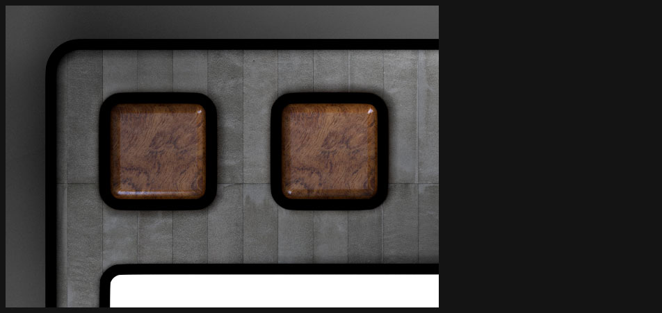
ButtonLabor - Materialien
- Windowframe: Beton
- Buttons: exotisches Bubinga Holz
-

ButtonLabor - Materialien
- Windowframe: Beton
- Buttons: exotisches Bubinga Holz
| interface | Project interface / "GUI - The History of Graphical User Interface" |
Metadata | |||||||||
|---|---|---|---|---|---|---|---|---|---|---|---|
| Date | 2004 | ||||||||||
| Size | 40kb | ||||||||||
Content GUI history: landmark interface samples / approach: poster / approach: "Buttonlaboratory" |
Duration | 4 months | |||||||||
| Media | digital | ||||||||||
| Applications used | |||||||||||
| Photoshop | Director | ||||||||||
| Illustrator | Indesign | ||||||||||
| contact me! | H | ||||||
|---|---|---|---|---|---|---|---|
| H | |||||||
| H | |||||||
| Address | |||||||
| Name | Klaudiusz Szatanik | ||||||
| Street | Ulmer Strasse 48 | ||||||
| City | 73066 Uhingen | ||||||
| Fon | 0173 3030301 | ||||||
| racl@klaudiusz.de | |||||||